ggplot
Table of Contents
1 ggplot intro
1.1 first examples ggplot
The next view lines are the first examples in the book ggplot from the author of the package H. Wickham - just a overview what is possible with qplot(); the diamond data set is a part of the ggplot2 package.
- first load the package
- load the data set
- create a small data set from diamonds using sample() (1000 rows)
- have a look on the data (head())
library(ggplot2)
data(diamonds)
dsmall <- diamonds[sample(nrow(diamonds),1000),]
head(diamonds)
carat       cut color clarity depth table price    x    y    z
1  0.23     Ideal     E     SI2  61.5    55   326 3.95 3.98 2.43
2  0.21   Premium     E     SI1  59.8    61   326 3.89 3.84 2.31
3  0.23      Good     E     VS1  56.9    65   327 4.05 4.07 2.31
4  0.29   Premium     I     VS2  62.4    58   334 4.20 4.23 2.63
5  0.31      Good     J     SI2  63.3    58   335 4.34 4.35 2.75
6  0.24 Very Good     J    VVS2  62.8    57   336 3.94 3.96 2.48
- and str()
str(diamonds)
'data.frame':   53940 obs. of  10 variables:
 $ carat  : num  0.23 0.21 0.23 0.29 0.31 0.24 0.24 0.26 0.22 0.23 ...
 $ cut    : Factor w/ 5 levels "Fair","Good",..: 5 4 2 4 2 3 3 3 1 3 ...
 $ color  : Factor w/ 7 levels "D","E","F","G",..: 2 2 2 6 7 7 6 5 2 5 ...
 $ clarity: Factor w/ 8 levels "I1","SI2","SI1",..: 2 3 5 4 2 6 7 3 4 5 ...
 $ depth  : num  61.5 59.8 56.9 62.4 63.3 62.8 62.3 61.9 65.1 59.4 ...
 $ table  : num  55 61 65 58 58 57 57 55 61 61 ...
 $ price  : int  326 326 327 334 335 336 336 337 337 338 ...
 $ x      : num  3.95 3.89 4.05 4.2 4.34 3.94 3.95 4.07 3.87 4 ...
 $ y      : num  3.98 3.84 4.07 4.23 4.35 3.96 3.98 4.11 3.78 4.05 ...
 $ z      : num  2.43 2.31 2.31 2.63 2.75 2.48 2.47 2.53 2.49 2.39 ...
Now we can start:
1.1.1 Simple Barcharts and Histograms
barchart of the variable cut which is a factor with five levels
qplot(cut, data=diamonds, geom="bar")

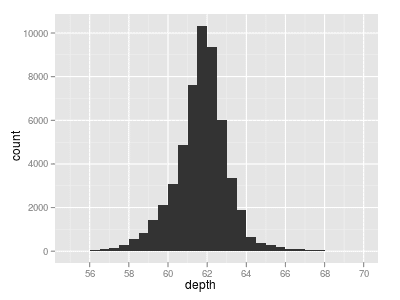
trying the same with a numeric (continuous) variable e.g. depth; Histogram:
qplot(depth, data=diamonds, geom="histogram")

If we look at this picture we notice ggplot has set the range of the x-axis apparently to wide. Type
range(diamonds$depth)
[1] 43 79
which give the min and the max of the depths
if you still want to change the visible part of the x-axis, you can do it with the xlim argument:
qplot(depth, xlim=c(55,70), data=diamonds, geom="histogram")
Besides the image R gives you the following line as result:
stat_bin: binwidth defaulted to range/30. Use 'binwidth = x' to adjust this.
so if you want to change the width of the bins add the binwidth argument
Now we have a look on the distribution of carat of the diamonds and change this argument:
qplot(carat, data=diamonds, geom="histogram", binwidth=1)

qplot(carat, data=diamonds, geom="histogram", binwidth=0.1)

qplot(carat, data=diamonds, geom="histogram", binwidth=0.01)

Every step we have a gain of information, the more bins we have the more information we get from the image.
1.1.2 Density Plots
For continuous variables you can use density instead of histogram.
qplot(carat, data=diamonds, geom="density")

If we want to compare different groups defined by a factor, we simply add the colour argument. Here we use the variable diamonds$color.
qplot(carat, data=diamonds, geom="density", colour=color)

Too many curves on one plot? No problem: we add a facets argument, which splits the one above into as many as levels of color
qplot(carat, data=diamonds, geom="density", facets=color~., colour=color)

And if we want to fill the curve (in the same color):
qplot(carat, data=diamonds, geom="density", facets=color~., colour=color, fill=color)

If you want to put two plots side by side on one image, use grid.arrange(). Install the package (if it is not installed yet) via install.packages("gridExtra").
First we load the library:library(gridExtra)
Now we can look at the densities depending on the color in on hand and clarity on the other:
p1 <- qplot(carat, data=diamonds, geom="density", facets=clarity~.,  fill=clarity)
p2 <- qplot(carat, data=diamonds, geom="density", facets=color~., fill=color)
grid.arrange(p1,p2, ncol=2)

Scatter Plots
Giving two arguments x and y to qplot() we will get back a scatter plot, through which we can investigate the relationship of them:
qplot(carat, price, data=diamonds)

qplot() accepts functions of variables as arguments:
qplot(log(carat), log(price), data=diamonds)

By using the colour argument, you can use a factor variable to color the points. In this example I use the column color of the diamonds data frame to define the different groups. The further argument alpha changes the transparency, it is numeric in the range [0,1] where 0 means completely transparent and 1 completely opaque. I() is a R function and stands for as is.
qplot(log(carat), log(price), data=diamonds, colour=color, alpha=I(1/7))

Instead of colour you can use the shape argument, it is more helpful especially when you are forced to create bw graphics. Unfortunately shape can only deal with with a maximum of 6 levels. So I chose the column cut. And - of course - it is more appropriate to use a smaller dataset. Additionally we use the size argument to change the size of the points according to the volume of the diamonds (the product x*y*z).
qplot(log(carat), log(price), data=dsmall, shape=cut, size=x*y*z)

Via geom argument (which is useful in lots of other ways) we can add a smoother (because we want to keep the points we also add point). You can turn off the drawing of the confidence interval by the argument se=FALSE.
qplot(log(carat), log(price), data=dsmall, geom=c("point","smooth"))

With method you can also change the smoother: loess, gam, lm etc pp.
qplot(log(carat), log(price), data=dsmall, geom=c("point","smooth"), method="lm")

Date: 2011-06-12 13:04:25 CEST
HTML generated by org-mode 7.4 in emacs 23
No comments :
Post a Comment