Showing posts with label R ggplot. Show all posts

Thursday, July 9, 2015

label outlier in ggplot2 boxplot

  • function to add labels to outliers in a ggplot2 boxplot
  • the function add.outlier() takes a ggplot boxplot object as input
  • the second optional input is a string containing the name of the variable containing the labels, the default is the value itself
  • the function expects a unique mapping to x and y, where x is a factor variable
  • the data frame given to the ggplot object must contain the x, y, and the labelling variable
require(ggplot2)

mtcars$cyl <- factor(mtcars$cyl)
mtcars$labels <- row.names(mtcars)

p <- ggplot(mtcars,aes(x=cyl,colour=cyl,y=qsec)) +
    geom_boxplot()


add.outlier <- function(p,labvar = as.character(p$mapping$y)){
      df <- data.frame(y = with(p$data,eval(p$mapping$y)),
                       x = with(p$data,eval(p$mapping$x)))
  
      df.l <- split(df,df$x)
      
      mm <- Reduce(rbind, lapply(df.l,FUN = function(df){
                                     data.frame(y = df$y[df$y <= (quantile(df$y)[2] - 1.5 * IQR(df$y)) | df$y >= (quantile(df$y)[4] + 1.5 * IQR(df$y))],
                                                x = df$x[df$y <= (quantile(df$y)[2] - 1.5 * IQR(df$y)) | df$y >= (quantile(df$y)[4] + 1.5 * IQR(df$y))]
                                                )})
                   )
  
      
      mm$x <- factor(mm$x,levels=sort(as.numeric(as.character(unique(p$data[,as.character(p$mapping$x)])))),
                     labels = levels(p$data[,as.character(p$mapping$x)])
                     )
      
      names(mm) <- c(as.character(p$mapping$y),as.character(p$mapping$x))
      mm <- merge(p$data[,c(names(mm),labvar)],mm)
      
      p + geom_text(data=mm,
                    aes_string(label=labvar),
                    vjust = -0.5)
}

add.outlier(p)


add.outlier(p,"labels")


Sunday, November 2, 2014

Graphics for Statistics - figures with ggplot2 - Chapter 3 part 2 Bar charts with errorbars, dot-whisker charts

1 Keen Chapter 3 part 2

Graphics out of the book Graphics for Statistics and Data Analysis with R by Kevin Keen (book home page)

1.1 Figure 3.8 Bar-whisker chart

  • we will work out the graphic on flipped axes and flip them later
  • set the aesthetics:
    • x to the names of the allergenes
    • y to the percentage (prevalence)
    • ymin to y minus the standard error and
    • ymax to y plus the standard error
  • using again geom_bar() with the stat="identity" option because we have already aggregated data (so the height of the bars is set by the y aesthetic)
  • set the filling and the colour of the edges (fill and colour), finally adjust the width (width) of the bars
  • there is no axis title on the axis with the names, so set xlab("") (remember we will flip the axis later)
  • set the title of the continuous axis to Percent and
  • set the limits of the axis to 0 and 50
  • set expansion of it to c(0,0) - because we did not want to expand the axis, it should actually end at 0 and 50
  • now we flip the axes
  • and set the appearance of the text, axis and background elements

require(ggplot2)

names<-c("Epidermals","Dust Mites","Weeds","Grasses","Molds","Trees")
prevs<-c(38.2,37.8,31.1,31.1,29.3,26.7)
se<-c(3.2,3.2,3.1,3.1,3.0,2.9)

df <- data.frame(item=factor(1:6,labels=names),prevs=prevs,se=se)

ggplot(df,aes(x=item,y=prevs,ymin=prevs-se,ymax=prevs+se)) +
    geom_bar(stat="identity",fill="transparent",colour="black",width=0.7) +
    geom_errorbar(width=0.3) +
    xlab("") +
    ylab("Percent") +
    scale_y_continuous(limits=c(0,50),expand=c(0,0)) +
    coord_flip() +
    theme(
        panel.background=element_blank(),
        axis.line=element_line(colour="black"),
        axis.line.y=element_blank(),
        axis.text=element_text(colour="black",size=14),
        axis.ticks.x=element_line(colour="black"),
        axis.ticks.y=element_blank()
        )


1.2 Figure 3.9 Bar and single whisker chart

  • the same as above, only change the filling of the bars to black (you do not need the colour argument any more) and the width of the error bars to 0

ggplot(df,aes(x=item,y=prevs,ymin=prevs-se,ymax=prevs+se)) +
    geom_bar(stat="identity",fill="black",width=0.7) +
    geom_errorbar(width=0) +
    xlab("") +
    ylab("Percent") +
    scale_y_continuous(limits=c(0,50),expand=c(0,0)) +
    coord_flip() +
    theme(
        panel.background=element_blank(),
        axis.line=element_line(colour="black"),
        axis.line.y=element_blank(),
        axis.text=element_text(colour="black",size=14),
        axis.ticks.x=element_line(colour="black"),
        axis.ticks.y=element_blank()
        )


1.3 Figure 3.10 Dot-whisker chart

  • for the dot-whisker chart we replace geom_bar() by geom_point()
  • in geom_point() we set the point size to four and the colour to black
  • in geom_errorbar() we set the the width to 0.3
  • add geom_vline() for the dotted lines and set the aesthetics xintercept to as.numeric(item) (because this aesthetic expects a numeric argument)
  • then change some elements in the theme section
    • set the colour in panel.border to black and do not forget to set fill to NA (you won't see anything if you don't)
    • remove the axis.line.y line


ggplot(df,aes(x=item,y=prevs,ymin=prevs-se,ymax=prevs+se)) +
    geom_point(colour="black",size=4) +
    geom_errorbar(width=0.25) +
    geom_vline(aes(xintercept=as.numeric(item)),linetype=3,size=0.4) +
    xlab("") +
    ylab("Percent") +
    scale_y_continuous(limits=c(0,50),expand=c(0,0)) +
    coord_flip() +
    theme(
        panel.background=element_blank(),
        panel.border=element_rect(colour="black",fill=NA),
        axis.line=element_line(colour="black"),
        axis.text=element_text(colour="black",size=14),
        axis.title=element_text(colour="black",size=14),
        axis.ticks.x=element_line(colour="black"),
        axis.ticks.y=element_blank()
        )


1.4 Figure 3.11 Dot-whisker chart

  • only minor changes to the previous plot
  • remove geom_vline()
  • adjust the widths of the error bars


ggplot(df,aes(x=item,y=prevs,ymin=prevs-se,ymax=prevs+se)) +
    geom_point(colour="black",size=4) +
    geom_errorbar(width=0.1) +
    xlab("") +
    ylab("Percent") +
    scale_y_continuous(limits=c(0,50),expand=c(0,0)) +
    coord_flip() +
    theme(
        panel.background=element_blank(),
        panel.border=element_rect(colour="black",fill=NA),
        axis.line=element_line(colour="black"),
        axis.text=element_text(colour="black",size=14),
        axis.title=element_text(colour="black",size=14),
        axis.ticks.x=element_line(colour="black"),
        axis.ticks.y=element_blank()
        )


1.5 Figure 3.12 Dot-whisker chart

  • only adjust the widths of the error bars


ggplot(df,aes(x=item,y=prevs,ymin=prevs-se,ymax=prevs+se)) +
    geom_point(colour="black",size=4) +
    geom_errorbar(width=0) +
    xlab("") +
    ylab("Percent") +
    scale_y_continuous(limits=c(0,50),expand=c(0,0)) +
    coord_flip() +
    theme(
        panel.background=element_blank(),
        panel.border=element_rect(colour="black",fill=NA),
        axis.line=element_line(colour="black"),
        axis.text=element_text(colour="black",size=14),
        axis.title=element_text(colour="black",size=14),
        axis.ticks.x=element_line(colour="black"),
        axis.ticks.y=element_blank()
        )


1.6 Figure 3.13 two-tiered dot-whisker chart

  • there are several possibilities
  • I decided to use two error bar layers so first
  • I have to move the aesthetics for ymin and ymax to geom_errorbar(), I set the width to 0.2
  • then I add a second geom_errorbar() set there also aesthetics but now ymin to prevs-1.96*se and ymax to prevs+1.96*se


ggplot(df,aes(x=item,y=prevs)) +
    geom_point(colour="black",size=4) +
    geom_errorbar(aes(ymin=prevs-se,ymax=prevs+se),width=0.2) +
    geom_errorbar(aes(ymin=prevs-1.96*se,ymax=prevs+1.96*se),width=0) +
    xlab("") +
    ylab("Percent") +
    scale_y_continuous(limits=c(0,50),expand=c(0,0)) +
    coord_flip() +
    theme(
        panel.background=element_blank(),
        panel.border=element_rect(colour="black",fill=NA),
        axis.line=element_line(colour="black"),
        axis.text=element_text(colour="black",size=14),
        axis.title=element_text(colour="black",size=14),
        axis.ticks.x=element_line(colour="black"),
        axis.ticks.y=element_blank()
        )


Friday, July 19, 2013

R ggbio - tracks

  • container for a plot you want to align
  • constructor tracks()
  • first we produce two plots:
require(ggbio)
require(gridExtra)
df1 <- data.frame(time = 1:100, score = sin((1:100)/20)*10)
p1 <- ggplot(data = df1, aes(x = time, y = score)) +
      geom_line()
df2 <- data.frame(time = 30:120, score = sin((30:120)/20)*10, value = rnorm(120-30 + 1))
p2 <- ggplot(data = df2, aes(x = time, y = score)) +
    geom_line() +
    geom_point(size = 2, aes(color = value))
grid.arrange(p1,p2)

  • the two plots have different scale on the x-axis
  • we want to align them on exactly the same x-axis to make it more easy to compare each other
tracks(p1,p2)

  • now add a theme (included in the ggbio package)
tracks(time1=p1,time2=p2) +
    xlim(1,40) +
    theme_tracks_sunset()

  • add a title
tracks(time1=p1,time2=p2,title="My title")

  • set background colors (for each of the single plots)
tracks(time1=p1,time2=p2,track.plot.color=c("darkred","darkgreen"))

  • set background color (for the whole tracks)
tracks(time1=p1,time2=p2,track.bg.color="darkred")

  • set color of the label borders and the filling
tracks(time1=p1,time2=p2,label.bg.color="darkred",label.bg.fill="lightblue")

  • set color and size of the label text and the width of the labels
tracks(time1=p1,time2=p2,label.text.color="midnightblue",label.text.cex=2,label.width=unit(2.5,"cm"))

  • other zoom methods:
    • scale along with the limits of a GRange

require(GenomicRanges)
gr <- GRanges("chr", IRanges(1, 40))
tracks(time1 = p1, time2 = p2) + xlim(gr)

  • scale along with the limits of a IRange
require(GenomicRanges)
gr <- GRanges("chr", IRanges(1, 40))
tracks(time1 = p1, time2 = p2) + xlim(ranges(gr))

  • change limits afterwards
require(GenomicRanges)
gr <- GRanges("chr", IRanges(1, 40))
trks <- tracks(time1 = p1, time2 = p2) + xlim(ranges(gr))
xlim(trks)
[1]  1 40
xlim(trks) <- c(1,30)
trks

Tuesday, June 18, 2013

R - Grammar of Graphics Figure 1.1 redone with ggplot


An Example (1.4)


  • first we have to get the data which are birth and death rates of the year 1990, therefore we use the world bank data (and of course, there is a package WDI providing direct access)
  • so load the package and download a list of indicators (WDIcache)
  • the resulting data frame contains indicator and name, and additional information (data description, source)

require(WDI)
indicators <- as.data.frame(WDIcache()$series)
names(indicators)
[1] "indicator"          "name"               "description"       
[4] "sourceDatabase"     "sourceOrganization"
  • then we have to find our two parameters of interest: the crude birth and the crude death rate:
    • we use grep on the column name to find them

grep("crude",indicators$name)
[1] 6553 6554
  • so we know that there are two lines containing the string crude in the name variable, so let's show them
indicators[grep("crude",indicators$name),]
indicator                                 name
6553 SP.DYN.CBRT.IN Birth rate, crude (per 1,000 people)
6554 SP.DYN.CDRT.IN Death rate, crude (per 1,000 people)
                                                                                                                                                                                                                                                                                                   description
6553 Crude birth rate indicates the number of live births occurring during the year, per 1,000 population estimated at midyear. Subtracting the crude death rate from the crude birth rate provides the rate of natural increase, which is equal to the rate of population change in the absence of migration.
6554      Crude death rate indicates the number of deaths occurring during the year, per 1,000 population estimated at midyear. Subtracting the crude death rate from the crude birth rate provides the rate of natural increase, which is equal to the rate of population change in the absence of migration.
                   sourceDatabase
6553 World Development Indicators
6554 World Development Indicators
                                                                                                                                                                                                                                                                                                                                                                                                                         sourceOrganization
6553 (1) United Nations Population Division. World Population Prospects, (2) United Nations Statistical Division. Population and Vital Statistics Reprot (various years), (3) Census reports and other statistical publications from national statistical offices, (4) Eurostat: Demographic Statistics, (5) Secretariat of the Pacific Community: Statistics and Demography Programme, and (6) U.S. Census Bureau: International Database.
6554 (1) United Nations Population Division. World Population Prospects, (2) United Nations Statistical Division. Population and Vital Statistics Reprot (various years), (3) Census reports and other statistical publications from national statistical offices, (4) Eurostat: Demographic Statistics, (5) Secretariat of the Pacific Community: Statistics and Demography Programme, and (6) U.S. Census Bureau: International Database.
  • now we now the indicators - and we can download the desired data (and just in case: we download them for the years 1980–2012)
rate.data <- WDI(country="all",indicator=indicators[grep("crude",indicators$name),1],start=1980,end=2012)
rate.data.1990 <- rate.data[rate.data$year==1990,]
head(rate.data.1990)
iso2c                                 country year SP.DYN.CBRT.IN
11     1A                              Arab World 1990       34.71824
44     1W                                   World 1990       25.85034
77     4E   East Asia & Pacific (developing only) 1990       22.84601
110    7E Europe & Central Asia (developing only) 1990       17.90782
143    8S                              South Asia 1990       32.91213
176    AD                                 Andorra 1990             NA
    SP.DYN.CDRT.IN
11        8.262026
44        9.266023
77        6.997506
110      10.065765
143      10.703840
176             NA


  • now we have to remove aggregations from these data (such as the European Union, Middle East, etc)
    • we use grepl on the iso2c column (which does the same as grep but returns logical values (of course you can also use grep again))
    • the iso2c is a two character, standardized country code
    • we eliminate all rows with iso2c starting with X, equals EU, containing a number, or equals ZQ, ZJ, ZG, or ZF

rate.data.1990 <- rate.data.1990[!grepl("^X|EU|\\d|Z[QJGF]",rate.data.1990$iso2c,perl=T),]
head(rate.data.1990)


    iso2c              country year SP.DYN.CBRT.IN SP.DYN.CDRT.IN
176    AD              Andorra 1990             NA             NA
209    AE United Arab Emirates 1990         25.916          2.794
242    AF          Afghanistan 1990         52.449         22.062
275    AG  Antigua and Barbuda 1990         20.100          6.800
308    AL              Albania 1990         24.610          5.909
341    AM              Armenia 1990         21.215          7.738
  • so that's the data frame
  • now the graphics
require(ggplot2)
require(gridExtra)
require(scales)

rate.data.1990$lab <- ifelse(rbinom(size=1,n=nrow(rate.data.1990),prob=0.2)==1,rate.data.1990$country,"")
ggplot(rate.data.1990,aes(x=SP.DYN.CBRT.IN,y=SP.DYN.CDRT.IN)) +
    stat_density2d(aes(colour= ..level..),bins=6,h=c(11,9),geom="density2d") +
    scale_x_continuous("Birth Rate", limits = c(0,60),breaks=seq(0,60,by=10),expand=c(0,1)) +
    scale_y_continuous("Death Rate", limits = c(0,30),breaks=seq(0,30,by=10),expand=c(0,1)) +
    scale_colour_gradientn(colours=c("blue","green","lightgreen","red"),guide="none") +
    geom_text(aes(label=lab),size=3,position = "jitter") +
    geom_abline(intersect=0,slope=1) +
    coord_fixed() +
    annotate("text",x=20,y=20,angle=45, label="Zero Population Growth",vjust=-0.5,size=4) +
    theme(
        panel.background=element_blank(),
        panel.border=element_rect(colour="black",fill="transparent"),
        axis.text = element_text(colour="black"),
        axis.ticks = element_line(colour="black"),
        axis.line = element_line(colour="black")
        ) 


  • note:
    • the plot in chapter 1.4 of the book uses an epanechnikov kernel, whereas ggplot uses a normal one
    • I choose randomly about 20% of the country names as labels (because I was to lazy to pick up exactly those used in the book)


Sunday, March 17, 2013

R Knoblauch/Maloney - MPDiR - Figure 2.1

  • rebuild some graphics from the book Knoblauch/Maloney: Modeling Psychophysical Data
  • from chapter 2 (Modeling), plotting age dependence of threshold for each level combination of Mtype and Sex using ggplot2 (page 27)
  • instead of the two panels we use two smooth() layers, loess is the default method for group sizes < 1000, so we only have to tell ggplot to use "lm" as method for one layer

  • we set se to F (se=F) in both of them which prevents the convidence intervals from being plotted

  • size, linetype, and colour are the corresponding parameters to lwd, lty, and col respectively

  • a nice list of line types and shapes of points

  • to plot a separate figure for every combination we use facet_wrap()

library(MPDiR)
data(Motion)
library(ggplot2)
ggplot(Motion, aes(x=LnAge,y=LnThresh)) + 
  geom_point() +
  geom_smooth(method="lm",se=F) +
  geom_smooth(se=F, size=2, linetype=2, colour="black") +
  facet_grid(Sex ~ Mtype,as.table=T)    


Wednesday, September 12, 2012

Graphics for Statistics - figures with ggplot - Chapter 3 - Bar Charts, Dot plot, add pic

chapter3


1 Chapter 3


Graphics out of the book Graphics for Statistics and Data Analysis with R by Kevin Keen (book home page)

  • here are the data
item<-c("Canada",
"Mexico",
"Saudi Arabia",
"Venezuela",
"Nigeria")

amount<-c(2460,1538,1394,1273,1120)
amount<-amount/1000

df <- data.frame(item=factor(1:5,labels=item),amount=amount)
barrel <- read.jpeg("barrel.jpg")

1.1 Figure 3.4 - simple bar chart


  • we use geom_bar to create the bar chart
  • customizing the y-axis by using scale_y_continuous: limits set the limits, expand defines the multiplicative and additive expansion constants
  • coord_flip rotates it (so we get a horizontal bar chart)
  • than we set the background to white
  • set the colour of the axis lines to black (we have to do this to axis.line not just axis.line.x because of inheritance)
  • get rid of the vertical axis
  • set colour of the ticks of the x-axis to black
  • get rid of the ticks of the y-axis
  • set the colour of the axis labels to black
  • change the adjustment of the labels of vertical axis
  • get rid of the grid lines (they are still visible if one looks carefully)
ggplot(df,aes(y=amount,x=reorder(item,-as.numeric(item)))) +
  geom_bar(stat="identity",fill="white",colour="black") +
  scale_y_continuous("Millions of Barrels per Day",limits=c(0,2.5),expand=c(0,0)) +
  xlab("") +
  coord_flip() +
  theme(panel.background=element_rect(fill="white"),
        axis.line=element_line(colour="black"),
        axis.line.y=element_blank(),
        axis.ticks.x=element_line(colour="black"),
        axis.ticks.y=element_blank(),
        axis.text=element_text(colour="black",size=11),
        axis.text.y=element_text(hjust=0),
        panel.grid=element_blank())
ggsave("fig3_4.png")
Saving 7 x 6.99 in image

1.2 Figure 3.5 - simple bar chart


  • we use geom_point to create the chart with dots (set the size of the dots to 3)
  • via geom_segment we add the dotted lines (linetype=3)
  • customizing the x-axis by using scale_x_continuous: limits set the limits, expand defines the multiplicative and additive expansion constants
  • set the colour of the axis lines to black (we have to do this to axis.line not just axis.line.x because of inheritance)
  • get rid of the vertical axis
  • set colour of the ticks of the x-axis to black
  • get rid of the ticks of the y-axis
  • set the colour of the axis labels to black
  • than we set the background to transparent and the colour of the frame to black (panel.background=element_rect)
  • get rid of the grid lines (they are still visible if one looks carefully)
  • get rid of of the title of the y-axis
  • set the colour and the size of the title of the x-axis to black and 11 respectively

ggplot(df,aes(x=amount,y=item)) +
  geom_point(size=3) +
  geom_segment(aes(yend=as.numeric(item)),xend=0,linetype=3) +
  scale_x_continuous("Millions of Barrels per Day",limits=c(0,2.5),expand=c(0,0)) +  
  theme(axis.line=element_line(colour="black"),
        axis.line.y=element_blank(),
        axis.ticks.y=element_blank(),
        axis.ticks.x=element_line(colour="black"),
        axis.text=element_text(colour="black",size=11),
        panel.background=element_rect(fill="transparent",colour="black"),
        panel.grid=element_blank(),
        axis.title.y=element_blank(),
        axis.title.x=element_text(colour="black",size=11)
        )
ggsave("fig3_5.png")


Saving 7 x 6.99 in image

1.3 Figure 3.7


  • the clipart can be downloaded here
  • we need the ReadImages package for reading this jpeg
  • we need the grid graphics package to divide the plot and insert to several parts
  • first we load two additional packages (ReadImages for reading the jpeg and grid for the grid graphics functions)
  • the next part (definition of the dot chart) is exactly the same as in figure 3.5
  • load the jpeg with the barrel (barrel <- read.jpeg("barrel.jpg"))
  • the next commands are part of the grid package, which is the underlying graphics system of ggplot2
    • grid.newpage moves to a new page
    • pushViewport adds a new viewport (plotting region) to the page (via x and y one can set the position), beginning in the top left corner, setting the width to 0.6 relative to the page and the height to 0.95; just sets the adjustment
    • print(p,newpage=F) prints the dot chart in this viewport
    • popViewport() closes the viewport
    • create another viewport next to the other one with width 0.4 and the same height
    • grid.raster inserts the picture of the barrel
    • grid.text inserts the text


library(grid)
library(ReadImages)

p <- ggplot(df,aes(x=amount,y=reorder(item,amount))) +
  geom_point(size=3) +
  geom_segment(aes(yend=reorder(item,amount)),xend=0,linetype=3) +
  scale_x_continuous("Millions of Barrels per Day",limits=c(0,2.5),expand=c(0,0)) +  
  theme(axis.line=element_line(colour="black"),
        axis.line.y=element_blank(),
        axis.ticks.y=element_blank(),
        axis.text=element_text(colour="black",size=12),
        panel.background=element_rect(fill="white",colour="black"),
        panel.grid=element_blank(),
        axis.title.y=element_blank(),
        axis.title.x=element_text(colour="black",size=11)
        )

barrel <- read.jpeg("barrel.jpg") 

grid.newpage()
pushViewport(viewport(x=unit(0,"line"),y=unit(1,"npc")-unit(2,"mm"),width=0.6,height=0.95,name="vp1",just=c("left","top")))
print(p,newpage=F)
popViewport()
pushViewport(viewport(x=unit(0.7,"npc"),y=unit(0,"npc"),width=0.4,height=0.95,name="vp1",just=c("left","bottom")))
grid.raster(barrel,width=unit(1,"npc"),just=c("centre","bottom"),x=unit(0.2,"npc"),y=unit(3,"line"))
grid.text("Top Five Importing\nCountries of Crude Oil\nand Petrolium\nProducts in 2007\nfor the united States",x=unit(0.2,"npc"),y=unit(1,"npc")-unit(2,"line"),just=c("center","top"))
savePlot("fig3_7.png")


Date: 2012-09-12 21:56:59 CEST

Author: mandy

Org version 7.8.02 with Emacs version 23

Validate XHTML 1.0


Monday, September 10, 2012

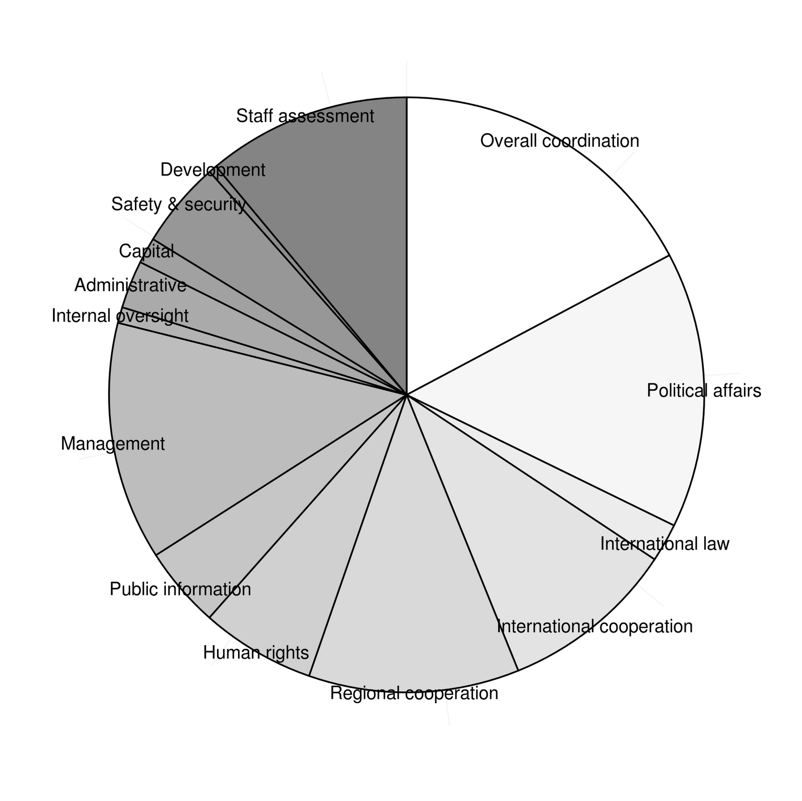
Graphics for Statistics - figures with ggplot - Chapter 2 Part 3 - Pie Charts

Graphics for Statistics - Chapter 2 - Pie Charts: Figures 2.11-2.12

Graphics out of the book Graphics for Statistics and Data Analysis with R by Kevin Keen (book home page)


Pie charts of the United Nations budget for 2008-2009


  • in the first two lines we define a vector of grays - using the definition out of the book
  • using geom_bar() with width 1
  • mapping x to "", y to amount1 and fill to item1
  • to put the labels on the plot we use geom_text mapping y to the mid of each block
  • and we use scale_fill_manual to set the colours to our predefined grays

Maybe now it is time to look what we have done so far:


grays1<-gray(((2*length(df$amount1)-1):0)/(2*length(df$amount1)-1))
grays<-grays1[1:length(amount)]

ggplot(df,aes(x="",y=amount1,fill=item1)) +
  geom_bar(width=1,colour="black") +
  geom_text(aes(y=c(0,cumsum(df$amount1)[-nrow(df)]) + df$amount/2,label=df$item1),x=1.5,size=4) +
  scale_fill_manual(values=grays)
ggsave("fig2_11a.png")
Saving 7 x 6.99 in image


  • now we transform our coordinate system via coord_polar using the y-axis to define the angle within the pie chart
  • we get rid of the legend, background, axis ticks, text etc
grays1<-gray(((2*length(df$amount1)-1):0)/(2*length(df$amount1)-1))
grays<-grays1[1:length(amount)]

ggplot(df,aes(x="",y=amount1,fill=item1)) +
  geom_bar(width=1,colour="black") +
  geom_text(aes(y=c(0,cumsum(df$amount1)[-nrow(df)]) + df$amount/2,label=df$item1),x=1.5,size=4) +
  scale_fill_manual(values=grays) +
  coord_polar(theta="y") +
  theme(panel.background=element_rect(fill="white"),
        axis.text.x=element_blank(),
        axis.text.y=element_blank(),
        axis.ticks.y=element_blank(),
        axis.title.x=element_blank(),
        axis.title.y=element_blank(),
        legend.position="none"
        )
ggsave("fig2_11.png")
Saving 7 x 6.99 in image


  • this is one of the cases one should consider using classical graphics
  • here is the code used by K. Keen:
pie(df$amount1,labels=df$item1, 
               radius = 0.85, 
               clockwise=TRUE,
               col=grays,
               angle=120)
savePlot("fig2_11b.png")

So far, I have no solution for the pattern in figure 2.12


Saturday, September 8, 2012

Graphics for Statistics - figures with ggplot - Chapter 2 Part 2 - Bar Chart Flavours

Graphics for Statistics - Chapter 2 - Bar Charts: Figures 2.3-2.10 + 2.13

Graphics out of the book Graphics for Statistics and Data Analysis with R by Kevin Keen (book home page)


Bar charts of the United Nations budget for 2008-2009


  • using geom_bar()
  • mapping x to item1 and y to amount1
  • set stat="identity" because of presummarised data
  • and there is the basic plot

ggplot(df,aes(x=item1,y=amount1)) +
  geom_bar(stat="identity")
ggsave("fig2_3.png")


Saving 7 x 6.99 in image


But of course there is a lot to do left: you can not read the labels of the x-axis and the we have to change the axis titles


ggplot(df,aes(x=item1,y=amount1)) +
  geom_bar(stat="identity") +
  xlab("") +
  ylab("Millions of US Dollars") +
  opts(axis.text.x=theme_text(angle=90,size=12))
ggsave("fig2_3b.png")

Saving 7 x 6.99 in image


  • and there is the graph in default ggplot style
  • now we the plot the style of the plot in the book:
  • add the expand argument to the definition of the y-axis to let the drawn axis end exactly at the limits
  • the width of the bins is changed through the width argument in geom_bar(); in this case it is a bit tricky, because using the identity stat resets width so we have to put width in to the aes() argument (further information)
  • we add a hjust argument in the axis.text.x to change the alignment
  • we set fill and colour of the background to white
  • we use a simple extension by Rudolf Cardinal (source line), because we want to remove just one axis not the two of them (further information)
  • and at the end like above, we use again the hack to get rid of the ticks of the x-axis

source("http://egret.psychol.cam.ac.uk/statistics/R/extensions/rnc_ggplot2_border_themes.r")
png("fig2_3c.png",height=500, width=500)
ggplot(df,aes(x=item1,y=amount1)) +
  geom_bar(aes(width=0.7),stat="identity") +
  scale_y_continuous("Millions of US Dollars",limits=c(0,800),expand=c(0,0)) +
  xlab("") +
  opts(axis.text.x=theme_text(angle=90,size=12,hjust=1),
       axis.text.y=theme_text(size=12),
       panel.background=theme_rect(fill="white",colour="white"),
       panel.border=theme_left_border()
       )
g <- grid.gget(gPath("axis-b", "", "", "", "axis.ticks.segments"))
grid.remove(g$name)
dev.off()
X11cairo 
       2


ggplot9.2 is out - and everything much easier:

  • you do not need to manipulate the grid elements directly, axis.ticks.x and axis.ticks.y are now available
  • there is also no need to use additional functions anymore: axis.line, axis.line.x and axis.line.y do a good job
  • maybe it this a bit confusing: first you have to set axis.line and then you you the axis blank you do not want to see, this is necessary because of the inheritance
  • there are also some functions renamed: use theme instead of opts and element instead of theme

## 9.2 version
ggplot(df,aes(x=item1,y=amount1)) +
  geom_bar(aes(width=0.7),stat="identity") +
  scale_y_continuous("Millions of US Dollars",limits=c(0,800),expand=c(0,0)) +
  xlab("") +
  theme(axis.text.x=element_text(angle=90,size=12,hjust=1,colour="black"),
        axis.text.y=element_text(size=12,colour="black"),
        axis.line=element_line(colour="black"),
        axis.line.x=element_blank(),
        axis.ticks.x=element_blank(),
        panel.background=element_rect(fill="white",colour="white")
       )
ggsave("fig2_3n.png")

Saving 7 x 6.99 in image


  • in figure 2.4 just the angle of the labels is changed, but therefore we have to adjust the alignment (add vjust argument)
  • also set the size of the labels to 11
  • savePlot() is a alternative to open and close a device explicitly

source("http://egret.psychol.cam.ac.uk/statistics/R/extensions/rnc_ggplot2_border_themes.r")
ggplot(df,aes(x=item1,y=amount1)) +
  geom_bar(aes(width=0.7),stat="identity") +
  scale_y_continuous("Millions of US Dollars",limits=c(0,800)) +
  xlab("") +
  opts(axis.text.x=theme_text(angle=45,size=12,hjust=1,vjust=1),
       axis.text.y=theme_text(size=12),
       panel.background=theme_rect(fill="white",colour="white"),
       panel.border=theme_left_border()       )
g <- grid.gget(gPath("axis-b", "", "", "", "axis.ticks.segments"))
grid.remove(g$name)
savePlot("fig2_4.png")


  • and here is also the code for ggplot v9.2

## 9.2 version
ggplot(df,aes(x=item1,y=amount1)) +
  geom_bar(aes(width=0.7),stat="identity") +
  scale_y_continuous("Millions of US Dollars",expand=c(0,0),limits=c(0,800)) +
  xlab("") +
  theme(axis.text.x=element_text(angle=45,size=11,hjust=1,vjust=1,colour="black"),
         axis.text.y=element_text(size=12,colour="black"),
         axis.line=element_line(colour="black"),
         axis.line.x=element_blank(),
         axis.ticks.x=element_blank(),
         panel.background=element_rect(fill="white",colour="white")
         )
ggsave("fig2_4n.png")


  • in figure 2.5 the axes are exchanged - so we can use the final code from figure 2.3
  • and do some minor changes (alignment, angle of labels)
ggplot(df,aes(x=item1,y=amount1)) +
  geom_bar(aes(width=0.7),stat="identity") +
  scale_y_continuous("Millions of US Dollars",limits=c(0,800),expand=c(0,0)) +
  xlab("") +
  coord_flip() +
  opts(axis.text.x=theme_text(size=11,vjust=-1),
       axis.text.y=theme_text(hjust=1,size=12),
       panel.background=theme_rect(fill="white",colour="white"),
       panel.border=theme_bottom_border()
       )
g <- grid.gget(gPath("axis-l", "", "", "", "axis.ticks.segments"))
grid.remove(g$name)
savePlot("fig2_5.png")


  • and here is the 9.2 version

ggplot(df,aes(x=item1,y=amount1)) +
  geom_bar(aes(width=0.7),stat="identity") +
  scale_y_continuous("Millions of US Dollars",limits=c(0,800),expand=c(0,0)) +
  xlab("") +
  coord_flip() +
  theme(axis.text.x=element_text(size=11,vjust=-1,colour="black"),
        axis.text.y=element_text(hjust=1,size=12,colour="black"),
        axis.line=element_line(colour="black"),
        axis.line.y=element_blank(),
        axis.ticks.y=element_blank(),
        axis.ticks.x=element_line(colour="black"),
        panel.background=element_rect(fill="white",colour="white")
       )
ggsave("fig2_5n.png")


  • for figure 2.6 we just remove the colour argument from panel.background, the panel.border option and add panel.grid.major=theme_blank() to get rid of the tracks of the grid lines
ggplot(df,aes(x=item1,y=amount1)) +
  geom_bar(aes(width=0.7),stat="identity") +
  scale_y_continuous("Millions of US Dollars",limits=c(0,800),expand=c(0,0)) +
  xlab("") +
  coord_flip() +
  opts(axis.text.x=theme_text(size=11,vjust=-1),
       axis.text.y=theme_text(hjust=1,size=12),
       panel.background=theme_rect(fill="white"),
       panel.grid.major=theme_blank()
       )
g <- grid.gget(gPath("axis-l", "", "", "", "axis.ticks.segments"))
grid.remove(g$name)
savePlot("fig2_6.png")


  • and again the 9.2 version

ggplot(df,aes(x=item1,y=amount1)) +
  geom_bar(aes(width=0.7),stat="identity") +
  scale_y_continuous("Millions of US Dollars",limits=c(0,800),expand=c(0,0)) +
  xlab("") +
  coord_flip() +
  theme(axis.text.x=element_text(size=11,vjust=-1,colour="black"),
       axis.text.y=element_text(hjust=1,size=12,colour="black"),
       axis.ticks.y=element_blank(),
        axis.ticks.x=element_line(colour="black"),
       panel.background=element_rect(fill="white",colour="black"),
       panel.grid.major=element_blank()
       )
ggsave("fig2_6n.png")

Saving 7 x 6.99 in image


  • from now all code is for ggplot2 version 9.2
  • figure 2.8 keep the vertical grid lines, but removes the horizontal ones: this is controlled by panel.grid.major.x and panel.grid.major.y (line elements)

ggplot(df,aes(x=item1,y=amount1)) +
  geom_bar(aes(width=0.7),stat="identity") +
  scale_y_continuous("Millions of US Dollars",limits=c(0,800),expand=c(0,0)) +
  xlab("") +
  coord_flip() +
  theme(axis.text.x=element_text(size=11,vjust=-1,colour="black"),
        axis.text.y=element_text(hjust=1,size=12,colour="black"),
        axis.ticks.y=element_blank(),
        axis.ticks.x=element_line(colour="black"),
        panel.background=element_rect(fill="white",colour="black"),
        panel.grid.major.y=element_blank(),
        panel.grid.major.x=element_line(colour="black")
       )
ggsave("fig2_8.png")

Saving 7 x 6.99 in image


  • for figure 2.9 we change the colour of the borders of the bars to black (colour) and the colour of the filling to grey (fill)

ggplot(df,aes(x=item1,y=amount1)) +
  geom_bar(aes(width=0.7),stat="identity",fill="grey",colour="black") +
  scale_y_continuous("Millions of US Dollars",limits=c(0,800),expand=c(0,0)) +
  xlab("") +
  coord_flip() +
  theme(axis.text.x=element_text(size=12,colour="black"),
        axis.text.y=element_text(size=12,colour="black"),
        axis.ticks.x=element_line(colour="black"),
        axis.ticks.y=element_blank(),
        axis.ticks.x=element_line(colour="black"),
        axis.line=element_line(colour="black"),
        axis.line.y=element_blank(),
        panel.background=element_rect(fill="white")
        )
ggsave("fig2_9.png")

Saving 7 x 6.99 in image


  • for figure 2.10 just the filling of the bars have to be changed to white

ggplot(df,aes(x=item1,y=amount1)) +
  geom_bar(aes(width=0.7),stat="identity",fill="white",colour="black") +
  scale_y_continuous("Millions of US Dollars",limits=c(0,800),expand=c(0,0)) +
  xlab("") +
  coord_flip() +
  theme(axis.text.x=element_text(size=12,colour="black"),
        axis.text.y=element_text(size=12,colour="black"),
        axis.ticks.x=element_line(colour="black"),
        axis.ticks.y=element_blank(),
        axis.ticks.x=element_line(colour="black"),
        axis.line=element_line(colour="black"),
        axis.line.y=element_blank(),
        panel.background=element_rect(fill="white")
        )
ggsave("fig2_10.png")


Saving 7 x 6.99 in image


  • for figure 2.13 figure 2.4 is a good beginning
  • set the colour of the filling of the bars to grey
  • we set the breaks and labels of the y-axis manually
  • add horizontal white lines via geom_hline
## 2.13
dollars <- paste("US$",c(200,400,600),"k",sep="")
ggplot(df,aes(x=item1,y=amount1)) +
  geom_bar(aes(width=0.7),stat="identity",fill="grey") +
  scale_y_continuous(expand=c(0,0),breaks=c(0,200,400,600),labels=c("0",dollars)) +
  geom_hline(yintercept=c(200,400,600),colour="white") +
  theme(axis.text=element_text(size=11.5,colour="black"),
        axis.text.x=element_text(angle=45,hjust=1,vjust=1),
        axis.ticks=element_blank(),
        axis.title=element_blank(),
        axis.line=element_line(colour="grey"),
        axis.line.y=element_blank(),
        panel.background=element_rect(fill="white",colour="white")
         )
ggsave("fig2_13.png")
Saving 7 x 6.99 in image


Graphics for Statistics - figures with ggplot - Chapter 2 - Cleveland Dot plot

Chapter 2 - Dot Charts


Graphics out of the book Graphics for Statistics and Data Analysis with R by Kevin Keen (book home page)


Dot charts of the United Nations budget for 2008-2009


  • data:

item1<-factor(1:14,
             labels=c("Overall coordination",
               "Political affairs",
               "International law",
               "International cooperation",
               "Regional cooperation",
               "Human rights",
               "Public information",
               "Management",
               "Internal oversight",
               "Administrative",
               "Capital",
               "Safety & security",
               "Development",
               "Staff assessment"))
amount1<-c(718555600,626069600,87269400,398449400,
477145600,259227500,184000500,540204300,35997700,
108470900,58782600,197169300,18651300,461366000)
amount1<-amount1/1000000
df <- data.frame(item1=item1,amount1=amount1)
df

item1  amount1
1       Overall coordination 718.5556
2          Political affairs 626.0696
3          International law  87.2694
4  International cooperation 398.4494
5       Regional cooperation 477.1456
6               Human rights 259.2275
7         Public information 184.0005
8                 Management 540.2043
9         Internal oversight  35.9977
10            Administrative 108.4709
11                   Capital  58.7826
12         Safety & security 197.1693
13               Development  18.6513
14          Staff assessment 461.3660

  • now we can build the chart using geom_point() and geom_hline()
  • first we build a ggplot object and map x to amount1 and y to item1
  • than we add the point layer (geom_point()) setting the shape to 19 (filled circle)
  • now we need the horizontal lines, therefore we use geom_hline() and map as.numeric(item1) (which gives 1:14) to yintercept

ggplot(df,aes(x=amount1,y=item1)) +
  geom_point(shape=19) +
  geom_hline(aes(yintercept=as.numeric(item1)),linetype=3)
ggsave("fig2_1.png")


  • first we reverse the order of the category using reorder() by the negative of the number of the item
  • then we increase the size of the points a little (size argument in geom_point())
  • then we change the title of the x-axis and set the limits to c(0,800) (scale_x_continuous())
  • setting asis.title.y to theme_blank() gets us rid of the title of the y-axis
  • axis.title.x is managed by theme_text(): we set the text size to 12 and adjust the vertical position (vjust) downwards
  • last we set the panel background to white using theme_rect() (and because there are some leftovers of the grid lines visible in the frame we set the major grid lines to blank

ggplot(df,aes(x=amount1,y=reorder(item1,-as.numeric(item1)))) +
  geom_point(shape=19,size=4) +
  geom_hline(aes(yintercept=as.numeric(item1)),linetype=3) +
  scale_x_continuous("Millions of US Dollars",limits=c(0,800)) +
  opts(axis.title.y=theme_blank(),
       axis.text.y=theme_text(size=12),
       axis.title.x=theme_text(size=12,vjust=-0.7),
       axis.text.x=theme_text(size=12),
       panel.background=theme_rect(fill="white"),
       panel.grid.major=theme_blank())
ggsave("fig2_1b.png")


  • remains the ticks of the y-axis, again we must use the hack (as in chapter 1 - have a look there for further information)

png("fig2_1c.png",height=500, width=500)
ggplot(df,aes(x=amount1,y=reorder(item1,-as.numeric(item1)))) +
  geom_point(shape=19,size=4) +
  geom_hline(aes(yintercept=as.numeric(item1)),linetype=3) +
  scale_x_continuous("Millions of US Dollars",limits=c(0,800)) +
  opts(axis.title.y=theme_blank(),
       axis.text.y=theme_text(size=12),
       axis.title.x=theme_text(size=12,vjust=-0.7),
       axis.text.x=theme_text(size=12),
       panel.background=theme_rect(fill="white"),
       panel.grid.major=theme_blank())
g <- grid.gget(gPath("axis-l", "", "", "", "axis.ticks.segments"))
grid.remove(g$name)
dev.off()

X11cairo 
       2


  • to change this figure to figure 2.2 we have just to replace geom_hline() by geom_segment() and change therefore some mappings

png("fig2_1d.png",height=500, width=500)
ggplot(df,aes(x=amount1,y=reorder(item1,-as.numeric(item1)))) +
  geom_point(shape=19,size=4) +
  geom_segment(aes(yend=reorder(item1,-as.numeric(item1))),xend=0,linetype=3) +
  scale_x_continuous("Millions of US Dollars",limits=c(0,800)) +
  opts(axis.title.y=theme_blank(),
       axis.text.y=theme_text(size=12),
       axis.title.x=theme_text(size=12,vjust=-0.7),
       axis.text.x=theme_text(size=12),
       panel.background=theme_rect(fill="white"),
       panel.grid.major=theme_blank())
g <- grid.gget(gPath("axis-l", "", "", "", "axis.ticks.segments"))
grid.remove(g$name)
dev.off()

X11cairo 
       2


R - Graphics for Statistics - figures with ggplot 2

chapter1


Graphics out of the book Graphics for Statistics and Data Analysis with R by Kevin Keen (book home page)


dot chart of prevalence of allergy in endoscopic sinus surgery (figure 1.1)


  • first create the data frame (which is mandatory)

names<-factor(1:6,labels=c("Epidermals","Dust Mites","Weeds","Grasses","Molds","Trees"))
prevs<-c(38.2,37.8,31.1,31.1,29.3,26.7)
df <- data.frame(names=names,prevs=prevs)
df

names prevs
1 Epidermals  38.2
2 Dust Mites  37.8
3      Weeds  31.1
4    Grasses  31.1
5      Molds  29.3
6      Trees  26.7

  • now we can create the dot chart using geomsegment() (lines) and geompoint()
  • we map x to prevs and y to names for all layers
  • in geom_segment() we map additionally yend to names and set xend to zero and linetype to 3 (dotted)
  • in geom_point() we set shape to 19 (small filled circle)
  • than we set the limits of the x axis to c(0,50) accordingly to the book chart, set the title to Percent and get rid of the title of the y axis

ggplot(df,aes(x=prevs,y=names)) + 
   geom_segment(aes(yend=names),xend=0,linetype=3) + 
   geom_point(shape=19) +
   scale_x_continuous("Percent",limits=c(0,50)) +
   opts(axis.title.y=theme_blank())
ggsave("fig1_1.png")


Saving 7 x 6.99 in image

bar chart of prevalence of allergy in endoscopic sinus surgery (figure 1.1)


  • now we map x to names and y to prevs
  • we use geombar(); we have to change the stat to "identity" because we use presummarised data (the default stat of the geom is "bin")
  • then we change the appearance of the axes as above

ggplot(df,aes(x=names,y=prevs)) + 
   geom_bar(stat="identity") +
   scale_y_continuous("Percent",limits=c(0,50)) +
   opts(axis.title.x=theme_blank())
ggsave("fig1_2.png")

Saving 7 x 6.99 in image


  • this looks fine for now; but in the book graph the labels are rotated and the bins are looking a bit narrower
  • the width of the bins is changed through the width argument in geom_bar(); in this case it is a bit tricky, because using the identity stat resets width so we have to put width in to the aes() argument (further information)
  • rotating the labels is done via opts() and text_theme() (angle)
  • I also resize the labels (size)
  • and get rid of the axis ticks (axis.ticks=theme_blank())

ggplot(df,aes(x=names,y=prevs)) + 
       geom_bar(aes(width=0.7),stat="identity") +
       scale_y_continuous("Percent",limits=c(0,50)) +
       opts(axis.title.x=theme_blank(),
            axis.text.x=theme_text(angle=90,size=12),
            axis.ticks=theme_blank())
ggsave("fig1_2b.png")

Saving 7 x 6.99 in image


  • unfortunately there are no ticks on the y axis as well, further more: in the current version of ggplot there is no equivalent to axis.ticks.x, so if you want to get rid of the ticks of just one axis you must use this hack (link)
  • another consequence is that ggsave does not work on the grid.remove edit - so we have to save the chart in the old fashioned way

png("fig1_2c.png",height=500, width=500)
ggplot(df,aes(x=names,y=prevs)) + 
       geom_bar(aes(width=0.5),stat="identity") +
       scale_y_continuous("Percent",limits=c(0,50)) +
       opts(axis.title.x=theme_blank(),
       axis.text.x=theme_text(angle=90,size=12))
g <- grid.gget(gPath("axis-b", "", "", "", "axis.ticks.segments"))
grid.remove(g$name)
dev.off()

X11cairo 
       2


ggplot9.2 is out - and everything much easier:

  • you do not need to manipulate the grid elements directly, axis.ticks.x and axis.ticks.y are now available
  • axis.line does a good job to customize the axes
  • there are also some functions renamed: use theme instead of opts and element instead of theme


ggplot(df,aes(x=names,y=prevs)) + 
  geom_bar(aes(width=0.5),stat="identity") +
  scale_y_continuous("Percent",limits=c(0,50),expand=c(0,0)) +
  theme(axis.title.x=element_blank(),
        axis.text.x=element_text(angle=90,size=12,colour="black",hjust=1),
        axis.text.y=element_text(size=12,colour="black"),
        axis.line=element_line(colour="black"),
        axis.ticks.x=element_blank(),
        panel.background=element_rect(fill="white")
        )