Graphics for Statistics - Chapter 2 - Pie Charts: Figures 2.11-2.12
Graphics out of the book Graphics for Statistics and Data Analysis with R by Kevin Keen (book home page)
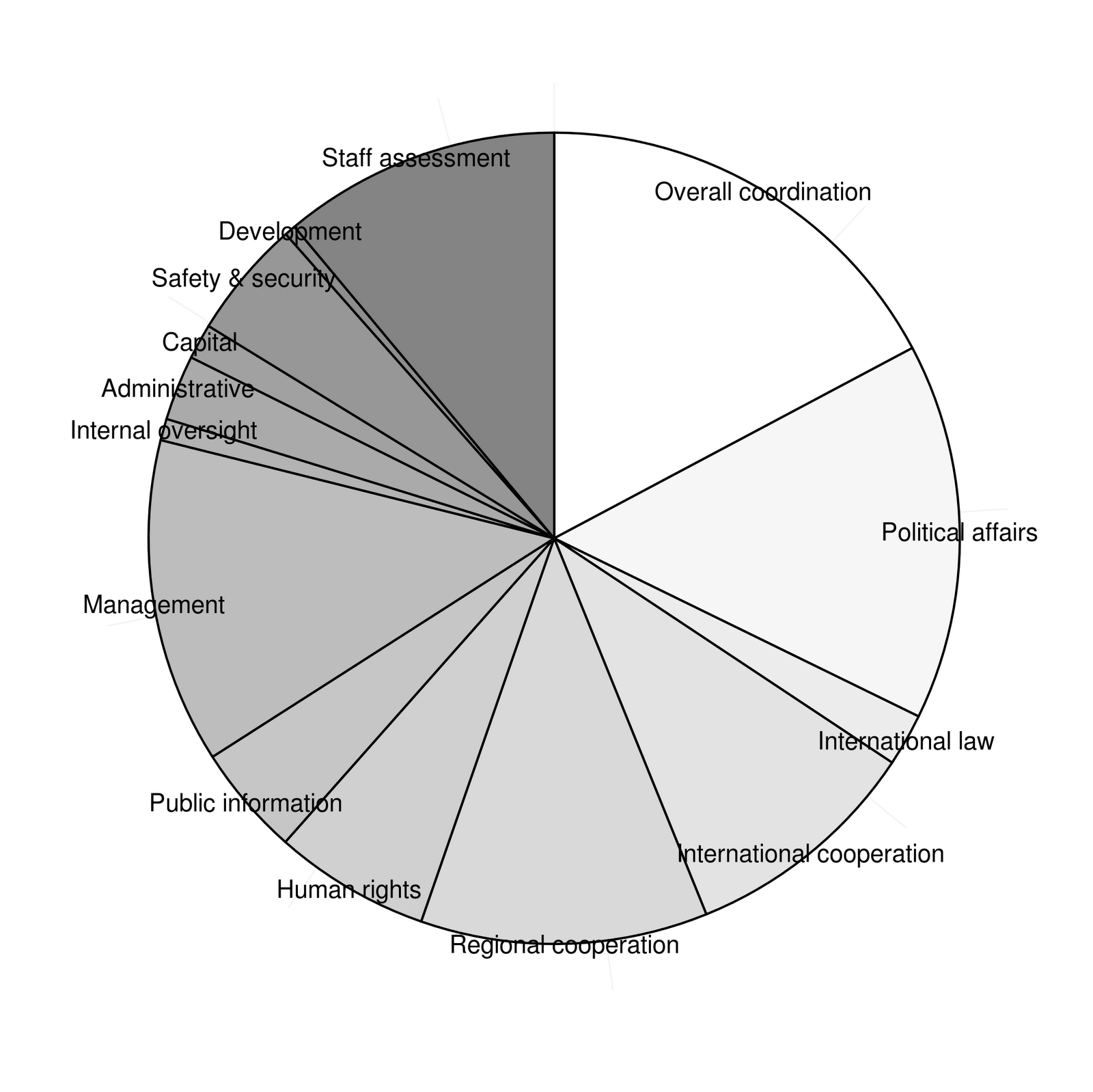
Pie charts of the United Nations budget for 2008-2009
- in the first two lines we define a vector of grays - using the definition out of the book
- using
geom_bar()with width 1
- mapping
xto "",ytoamount1andfilltoitem1
- to put the labels on the plot we use
geom_textmappingyto the mid of each block
- and we use
scale_fill_manualto set the colours to our predefined grays
Maybe now it is time to look what we have done so far:
grays1<-gray(((2*length(df$amount1)-1):0)/(2*length(df$amount1)-1))
grays<-grays1[1:length(amount)]

ggplot(df,aes(x="",y=amount1,fill=item1)) +
  geom_bar(width=1,colour="black") +
  geom_text(aes(y=c(0,cumsum(df$amount1)[-nrow(df)]) + df$amount/2,label=df$item1),x=1.5,size=4) +
  scale_fill_manual(values=grays)
ggsave("fig2_11a.png")
Saving 7 x 6.99 in image

- now we transform our coordinate system via
coord_polarusing the y-axis to define the angle within the pie chart
- we get rid of the legend, background, axis ticks, text etc
grays1<-gray(((2*length(df$amount1)-1):0)/(2*length(df$amount1)-1))
grays<-grays1[1:length(amount)]

ggplot(df,aes(x="",y=amount1,fill=item1)) +
  geom_bar(width=1,colour="black") +
  geom_text(aes(y=c(0,cumsum(df$amount1)[-nrow(df)]) + df$amount/2,label=df$item1),x=1.5,size=4) +
  scale_fill_manual(values=grays) +
  coord_polar(theta="y") +
  theme(panel.background=element_rect(fill="white"),
        axis.text.x=element_blank(),
        axis.text.y=element_blank(),
        axis.ticks.y=element_blank(),
        axis.title.x=element_blank(),
        axis.title.y=element_blank(),
        legend.position="none"
        )
ggsave("fig2_11.png")
Saving 7 x 6.99 in image
- this is one of the cases one should consider using classical graphics
- here is the code used by K. Keen:
pie(df$amount1,labels=df$item1,
               radius = 0.85,
               clockwise=TRUE,
               col=grays,
               angle=120)
savePlot("fig2_11b.png")

So far, I have no solution for the pattern in figure 2.12
Please check out r package 'patternplot' for pattern in pie chart
ReplyDeletehttps://cran.r-project.org/web/packages/patternplot/vignettes/patternplot-intro.html