- fonts
- you can set the family via the family argument within every plot command
- the specified font must be installed
- the generic (R-) fonts are always available (serif, sans, mono)
- only the text produced by this command will be affected
par(mfrow=c(2,3))
par(mar=c(6,7,5,1)+0.1) ## set plot margins appropriate
plot(c(0,1),c(0,1),bty='n',type='n',xlab="x axis",ylab="y axis",cex.lab=2)
text(.5,.5,labels="Waree",family="Waree",cex=2)
plot(c(0,1),c(0,1),bty='n',type='n',xlab="x axis",ylab="y axis",cex.lab=2)
text(.5,.5,labels="Nimbus Mono",family="Nimbus Mono",cex=2)
plot(c(0,1),c(0,1),bty='n',type='n',xlab="x axis",ylab="y axis",cex.lab=2)
text(.5,.5,labels="Century Schoolbook L",family="Century Schoolbook L",cex=2)
plot(c(0,1),c(0,1),bty='n',type='n',xlab="x axis",ylab="y axis",cex.lab=2)
text(.5,.5,labels="Liberation Serif",family="Liberation Serif",cex=2)
plot(c(0,1),c(0,1),bty='n',type='n',xlab="x axis",ylab="y axis",cex.lab=2)
text(.5,.5,labels="URW Gothic L",family="URW Gothic L",cex=2)
plot(c(0,1),c(0,1),bty='n',type='n',xlab="x axis",ylab="y axis",cex.lab=2)
text(.5,.5,labels="URW Palladio L",family="URW Palladio L",cex=2)

- it is better to set family via par, so all following produced text is uniform
par(mfrow=c(2,2))
par(mar=c(6,7,5,1)+0.1) ## set plot margins appropriate
par(family="Waree") ## set family
plot(c(0,1),c(0,1),bty='n',type='n',xlab="x axis",ylab="y axis",cex.lab=2)
text(.5,.5,labels="Waree",cex=2)
par(family="URW Palladio L") ## set family
plot(c(0,1),c(0,1),bty='n',type='n',xlab="x axis",ylab="y axis",cex.lab=2)
text(.5,.5,labels="URW Palladio L",cex=2)
par(family="Tlwg Typo") ## set family
plot(c(0,1),c(0,1),bty='n',type='n',xlab="x axis",ylab="y axis",cex.lab=2)
text(.5,.5,labels="Tlwg Typo",cex=2)
par(family="Ubuntu Mono") ## set family
plot(c(0,1),c(0,1),bty='n',type='n',xlab="x axis",ylab="y axis",cex.lab=2)
text(.5,.5,labels="Ubuntu Mono",cex=2)

- you can set the family via the family argument within every plot command
Tuesday, December 18, 2012
R graphics - customizing text - font


R graphics - customizing text - text size
- text size
- there are ps and cex
- ps defines an absolute text size
- cex specifies a multiplicative modifier
- final font size = fontsize * cex
- cex is used e.g. in cex.axis (text drawn as tick labels), cex.lab (axis labels), cex.main (title), cex.sub (subtitle)
- cex affects in most cases the plot symbols
par(mfrow=c(2,3))
par(mar=c(6,7,5,1)+0.1) ## set plot margins appropriate
plot(1:10,1:10,bty='n',xlab="x axis",ylab="y axis",sub="subtitle",main="title")
plot(1:10,1:10,bty='n',xlab="x axis",ylab="y axis",sub="subtitle",main="title (mult: 2)",cex.main=2,cex=2)
plot(1:10,1:10,bty='n',xlab="x axis  (mult: 2)",ylab="y axis (mult: 2)",sub="subtitle",main="title",cex.lab=2,cex=3)
plot(1:10,1:10,bty='n',xlab="x axis",ylab="y axis",sub="subtitle (mult: 2)",main="title (mult: 2)",cex.main=2,cex.sub=2,cex=0.5)
plot(1:10,1:10,bty='n',xlab="x axis",ylab="y axis",sub="subtitle (mult: 2)",main="title (mult: 0.5)",cex.main=0.5,cex.sub=2,cex=seq(1,5))
plot(1:10,1:10,bty='n',xlab="x axis  (mult: 3)",ylab="y axis (mult: 3)",sub="subtitle",main="title (mult: 4)", cex.lab=3,cex.main=4,cex=sample(4,10,replace=T))

- ps is set through par()
- the default value is 12
- in the following graph ps is subsequently set to default, 9, 15, 5
par(mfrow=c(2,2))
plot(1:10,1:10,bty='n',xlab="x axis",ylab="y axis",sub="subtitle",main="title")
par(ps=9)
plot(1:10,1:10,bty='n',xlab="x axis",ylab="y axis",sub="subtitle",main="title")
par(ps=15)
plot(1:10,1:10,bty='n',xlab="x axis",ylab="y axis",sub="subtitle",main="title")
par(ps=5)
plot(1:10,1:10,bty='n',xlab="x axis",ylab="y axis",sub="subtitle",main="title")

- there are ps and cex


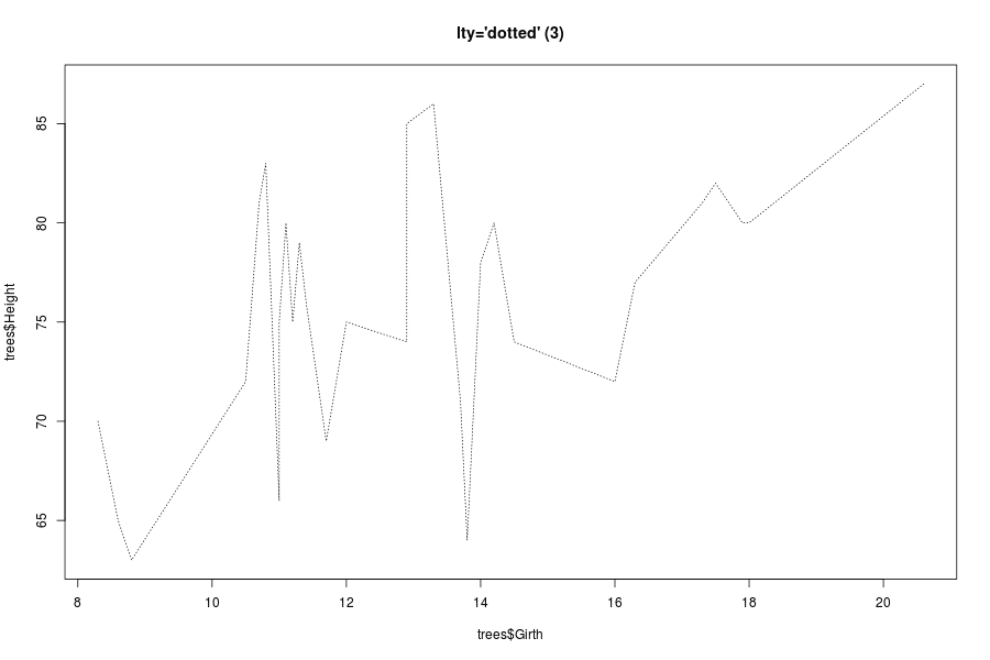
R graphics - par() - lty
line types
- again we use the tree data set as example data set
head(trees)
Girth Height Volume
1   8.3     70   10.3
2   8.6     65   10.3
3   8.8     63   10.2
4  10.5     72   16.4
5  10.7     81   18.8
6  10.8     83   19.7
- there are few arguments which control the appearance of lines
- lty line type
- lwd line width and of course
- col color
- lty line type
- first we have a look at lty, one can change the style of the line specifying the type either as a string or the corresponding integer, the default appearance is a solid (or 1), black line:
plot(trees$Girth,trees$Height,type="l",main="lty default ('solid')") ## a default line

- dashed line
plot(trees$Girth,trees$Height,type="l",lty=2,main="lty='dashed' (2)") ## a dashed line

- dotted line
plot(trees$Girth,trees$Height,type="l",lty=3,main="lty='dotted' (3)") ## a dotted line
dot-dash-line
plot(trees$Girth,trees$Height,type="l",lty=4,main="lty='dotdash' (4)") ## a dotdash line

- long dashes
plot(trees$Girth,trees$Height,type="l",lty=5,main="lty='longdash' (5)") ## a long dash line

- two dashes
plot(trees$Girth,trees$Height,type="l",lty=6,main="lty='twodash' (6)") ## a two-dash line

- custom line types
- you can also define a custom line type by specifying a string of length 2, 4, 6, or 8 which consists of non-zero hexadecimal digits
- each digit gives the length of a segment, alternatively drawn and skipped
- the unit of these segments are proportional to the line width (defined by lwd)
- here are some examples:
- a long line (15 units) followed by short off (4 units) followed by 3 units on, off, on, off; once with default line width and once with lwd=4
- a long line (15 units) followed by short off (4 units) followed by 3 units on, off, on, off; once with default line width and once with lwd=4
par(mfrow=c(1,2))
plot(1:10,sample(10),type="l",lty="F43333", main="lty='F43333', lwd=1")
plot(1:10,sample(10),type="l",lwd=4, lty="F43333", main="lty='F43333', lwd=4")

- a line (10 units) followed by 10 units off followed by 5 units on, 2 units off, 5 units on, 2 units off; once with default line width and once with lwd=2
par(mfrow=c(1,2))
plot(1:10,sample(10),type="l",lty="AA5252", main="lty='AA5252', lwd=1")
plot(1:10,sample(10),type="l",lwd=4, lty="AA5252", main="lty='AA5252', lwd=2")

- you can also define a custom line type by specifying a string of length 2, 4, 6, or 8 which consists of non-zero hexadecimal digits


R graphics plot types
scatter plot types
- we use the tree data set as example data set
head(trees)
Girth Height Volume
1   8.3     70   10.3
2   8.6     65   10.3
3   8.8     63   10.2
4  10.5     72   16.4
5  10.7     81   18.8
6  10.8     83   19.7
par(mfrow=c(3,3))
plot(trees$Girth,trees$Height,type="p",main="type='p'") ## points
plot(trees$Girth,trees$Height,type="l",main="type='l'") ## a line
plot(trees$Girth,trees$Height,type="b",main="type='b'") ## both
plot(trees$Girth,trees$Height,type="o",main="type='o'") ## both overplotted
plot(trees$Girth,trees$Height,type="c",main="type='c'") ## lines like in "b"
plot(trees$Girth,trees$Height,type="h",main="type='h'") ## vertical lines
plot(trees$Girth,trees$Height,type="s",main="type='s'") ## stair steps (first horizontal)
plot(trees$Girth,trees$Height,type="S",main="type='S'") ## stair steps (first vertical)
plot(trees$Girth,trees$Height,type="n",main="type='n'") ## none

Wednesday, September 12, 2012
Graphics for Statistics - figures with ggplot - Chapter 3 - Bar Charts, Dot plot, add pic
chapter3
Table of Contents
1 Chapter 3
Graphics out of the book Graphics for Statistics and Data Analysis with R by Kevin Keen (book home page)
- here are the data
item<-c("Canada",
"Mexico",
"Saudi Arabia",
"Venezuela",
"Nigeria")

amount<-c(2460,1538,1394,1273,1120)
amount<-amount/1000

df <- data.frame(item=factor(1:5,labels=item),amount=amount)
barrel <- read.jpeg("barrel.jpg")
1.1 Figure 3.4 - simple bar chart
- we use
geom_barto create the bar chart
- customizing the y-axis by using
scale_y_continuous:limitsset the limits,expanddefines the multiplicative and additive expansion constants
coord_fliprotates it (so we get a horizontal bar chart)
- than we set the background to white
- set the colour of the axis lines to black (we have to do this to axis.line not just axis.line.x because of inheritance)
- get rid of the vertical axis
- set colour of the ticks of the x-axis to black
- get rid of the ticks of the y-axis
- set the colour of the axis labels to black
- change the adjustment of the labels of vertical axis
- get rid of the grid lines (they are still visible if one looks carefully)
ggplot(df,aes(y=amount,x=reorder(item,-as.numeric(item)))) +
  geom_bar(stat="identity",fill="white",colour="black") +
  scale_y_continuous("Millions of Barrels per Day",limits=c(0,2.5),expand=c(0,0)) +
  xlab("") +
  coord_flip() +
  theme(panel.background=element_rect(fill="white"),
        axis.line=element_line(colour="black"),
        axis.line.y=element_blank(),
        axis.ticks.x=element_line(colour="black"),
        axis.ticks.y=element_blank(),
        axis.text=element_text(colour="black",size=11),
        axis.text.y=element_text(hjust=0),
        panel.grid=element_blank())
ggsave("fig3_4.png")
Saving 7 x 6.99 in image

1.2 Figure 3.5 - simple bar chart
- we use
geom_pointto create the chart with dots (set the size of the dots to 3)
- via
geom_segmentwe add the dotted lines (linetype=3)
- customizing the x-axis by using
scale_x_continuous:limitsset the limits,expanddefines the multiplicative and additive expansion constants
- set the colour of the axis lines to black (we have to do this to axis.line not just axis.line.x because of inheritance)
- get rid of the vertical axis
- set colour of the ticks of the x-axis to black
- get rid of the ticks of the y-axis
- set the colour of the axis labels to black
- than we set the background to transparent and the colour of the frame to black (
panel.background=element_rect)
- get rid of the grid lines (they are still visible if one looks carefully)
- get rid of of the title of the y-axis
- set the colour and the size of the title of the x-axis to black and 11 respectively
ggplot(df,aes(x=amount,y=item)) +
  geom_point(size=3) +
  geom_segment(aes(yend=as.numeric(item)),xend=0,linetype=3) +
  scale_x_continuous("Millions of Barrels per Day",limits=c(0,2.5),expand=c(0,0)) +
  theme(axis.line=element_line(colour="black"),
        axis.line.y=element_blank(),
        axis.ticks.y=element_blank(),
        axis.ticks.x=element_line(colour="black"),
        axis.text=element_text(colour="black",size=11),
        panel.background=element_rect(fill="transparent",colour="black"),
        panel.grid=element_blank(),
        axis.title.y=element_blank(),
        axis.title.x=element_text(colour="black",size=11)
        )
ggsave("fig3_5.png")
Saving 7 x 6.99 in image

1.3 Figure 3.7
- the clipart can be downloaded here
- we need the ReadImages package for reading this jpeg
- we need the grid graphics package to divide the plot and insert to several parts
- first we load two additional packages (ReadImages for reading the jpeg and grid for the grid graphics functions)
- the next part (definition of the dot chart) is exactly the same as in figure 3.5
- load the jpeg with the barrel (
barrel <- read.jpeg("barrel.jpg"))
- the next commands are part of the grid package, which is the underlying graphics system of ggplot2
grid.newpagemoves to a new page
pushViewportadds a new viewport (plotting region) to the page (via x and y one can set the position), beginning in the top left corner, setting the width to 0.6 relative to the page and the height to 0.95;justsets the adjustment
print(p,newpage=F)prints the dot chart in this viewport
popViewport()closes the viewport
- create another viewport next to the other one with width 0.4 and the same height
grid.rasterinserts the picture of the barrel
grid.textinserts the text
library(grid)
library(ReadImages)

p <- ggplot(df,aes(x=amount,y=reorder(item,amount))) +
  geom_point(size=3) +
  geom_segment(aes(yend=reorder(item,amount)),xend=0,linetype=3) +
  scale_x_continuous("Millions of Barrels per Day",limits=c(0,2.5),expand=c(0,0)) +
  theme(axis.line=element_line(colour="black"),
        axis.line.y=element_blank(),
        axis.ticks.y=element_blank(),
        axis.text=element_text(colour="black",size=12),
        panel.background=element_rect(fill="white",colour="black"),
        panel.grid=element_blank(),
        axis.title.y=element_blank(),
        axis.title.x=element_text(colour="black",size=11)
        )

barrel <- read.jpeg("barrel.jpg")

grid.newpage()
pushViewport(viewport(x=unit(0,"line"),y=unit(1,"npc")-unit(2,"mm"),width=0.6,height=0.95,name="vp1",just=c("left","top")))
print(p,newpage=F)
popViewport()
pushViewport(viewport(x=unit(0.7,"npc"),y=unit(0,"npc"),width=0.4,height=0.95,name="vp1",just=c("left","bottom")))
grid.raster(barrel,width=unit(1,"npc"),just=c("centre","bottom"),x=unit(0.2,"npc"),y=unit(3,"line"))
grid.text("Top Five Importing\nCountries of Crude Oil\nand Petrolium\nProducts in 2007\nfor the united States",x=unit(0.2,"npc"),y=unit(1,"npc")-unit(2,"line"),just=c("center","top"))
savePlot("fig3_7.png")

Monday, September 10, 2012
Graphics for Statistics - figures with ggplot - Chapter 2 Part 3 - Pie Charts
Graphics for Statistics - Chapter 2 - Pie Charts: Figures 2.11-2.12
Graphics out of the book Graphics for Statistics and Data Analysis with R by Kevin Keen (book home page)
Pie charts of the United Nations budget for 2008-2009
- in the first two lines we define a vector of grays - using the definition out of the book
- using
geom_bar()with width 1
- mapping
xto "",ytoamount1andfilltoitem1
- to put the labels on the plot we use
geom_textmappingyto the mid of each block
- and we use
scale_fill_manualto set the colours to our predefined grays
Maybe now it is time to look what we have done so far:
grays1<-gray(((2*length(df$amount1)-1):0)/(2*length(df$amount1)-1))
grays<-grays1[1:length(amount)]

ggplot(df,aes(x="",y=amount1,fill=item1)) +
  geom_bar(width=1,colour="black") +
  geom_text(aes(y=c(0,cumsum(df$amount1)[-nrow(df)]) + df$amount/2,label=df$item1),x=1.5,size=4) +
  scale_fill_manual(values=grays)
ggsave("fig2_11a.png")
Saving 7 x 6.99 in image

- now we transform our coordinate system via
coord_polarusing the y-axis to define the angle within the pie chart
- we get rid of the legend, background, axis ticks, text etc
grays1<-gray(((2*length(df$amount1)-1):0)/(2*length(df$amount1)-1))
grays<-grays1[1:length(amount)]

ggplot(df,aes(x="",y=amount1,fill=item1)) +
  geom_bar(width=1,colour="black") +
  geom_text(aes(y=c(0,cumsum(df$amount1)[-nrow(df)]) + df$amount/2,label=df$item1),x=1.5,size=4) +
  scale_fill_manual(values=grays) +
  coord_polar(theta="y") +
  theme(panel.background=element_rect(fill="white"),
        axis.text.x=element_blank(),
        axis.text.y=element_blank(),
        axis.ticks.y=element_blank(),
        axis.title.x=element_blank(),
        axis.title.y=element_blank(),
        legend.position="none"
        )
ggsave("fig2_11.png")
Saving 7 x 6.99 in image
- this is one of the cases one should consider using classical graphics
- here is the code used by K. Keen:
pie(df$amount1,labels=df$item1,
               radius = 0.85,
               clockwise=TRUE,
               col=grays,
               angle=120)
savePlot("fig2_11b.png")

So far, I have no solution for the pattern in figure 2.12
Saturday, September 8, 2012
Graphics for Statistics - figures with ggplot - Chapter 2 Part 2 - Bar Chart Flavours
Graphics for Statistics - Chapter 2 - Bar Charts: Figures 2.3-2.10 + 2.13
Graphics out of the book Graphics for Statistics and Data Analysis with R by Kevin Keen (book home page)
Bar charts of the United Nations budget for 2008-2009
- using
geom_bar()
- mapping
xtoitem1andytoamount1
- set stat="identity" because of presummarised data
- and there is the basic plot
ggplot(df,aes(x=item1,y=amount1)) +
  geom_bar(stat="identity")
ggsave("fig2_3.png")

Saving 7 x 6.99 in image
But of course there is a lot to do left: you can not read the labels of the x-axis and the we have to change the axis titles
ggplot(df,aes(x=item1,y=amount1)) +
  geom_bar(stat="identity") +
  xlab("") +
  ylab("Millions of US Dollars") +
  opts(axis.text.x=theme_text(angle=90,size=12))
ggsave("fig2_3b.png")
Saving 7 x 6.99 in image

- and there is the graph in default ggplot style
- now we the plot the style of the plot in the book:
- add the
expandargument to the definition of the y-axis to let the drawn axis end exactly at the limits
- the width of the bins is changed through the
widthargument ingeom_bar(); in this case it is a bit tricky, because using the identity stat resetswidthso we have to putwidthin to theaes()argument (further information)
- we add a
hjustargument in theaxis.text.xto change the alignment
- we set
fillandcolourof the background to white
- we use a simple extension by Rudolf Cardinal (source line), because we want to remove just one axis not the two of them (further information)
- and at the end like above, we use again the hack to get rid of the ticks of the x-axis
source("http://egret.psychol.cam.ac.uk/statistics/R/extensions/rnc_ggplot2_border_themes.r")
png("fig2_3c.png",height=500, width=500)
ggplot(df,aes(x=item1,y=amount1)) +
  geom_bar(aes(width=0.7),stat="identity") +
  scale_y_continuous("Millions of US Dollars",limits=c(0,800),expand=c(0,0)) +
  xlab("") +
  opts(axis.text.x=theme_text(angle=90,size=12,hjust=1),
       axis.text.y=theme_text(size=12),
       panel.background=theme_rect(fill="white",colour="white"),
       panel.border=theme_left_border()
       )
g <- grid.gget(gPath("axis-b", "", "", "", "axis.ticks.segments"))
grid.remove(g$name)
dev.off()
X11cairo
       2
ggplot9.2 is out - and everything much easier:
- you do not need to manipulate the grid elements directly,
axis.ticks.xandaxis.ticks.yare now available
- there is also no need to use additional functions anymore:
axis.line,axis.line.xandaxis.line.ydo a good job
- maybe it this a bit confusing: first you have to set
axis.lineand then you you the axis blank you do not want to see, this is necessary because of the inheritance
- there are also some functions renamed: use
themeinstead ofoptsandelementinstead oftheme
## 9.2 version
ggplot(df,aes(x=item1,y=amount1)) +
  geom_bar(aes(width=0.7),stat="identity") +
  scale_y_continuous("Millions of US Dollars",limits=c(0,800),expand=c(0,0)) +
  xlab("") +
  theme(axis.text.x=element_text(angle=90,size=12,hjust=1,colour="black"),
        axis.text.y=element_text(size=12,colour="black"),
        axis.line=element_line(colour="black"),
        axis.line.x=element_blank(),
        axis.ticks.x=element_blank(),
        panel.background=element_rect(fill="white",colour="white")
       )
ggsave("fig2_3n.png")
Saving 7 x 6.99 in image

- in figure 2.4 just the angle of the labels is changed, but therefore we have to adjust the alignment (add
vjustargument)
- also set the size of the labels to 11
- savePlot() is a alternative to open and close a device explicitly
source("http://egret.psychol.cam.ac.uk/statistics/R/extensions/rnc_ggplot2_border_themes.r")
ggplot(df,aes(x=item1,y=amount1)) +
  geom_bar(aes(width=0.7),stat="identity") +
  scale_y_continuous("Millions of US Dollars",limits=c(0,800)) +
  xlab("") +
  opts(axis.text.x=theme_text(angle=45,size=12,hjust=1,vjust=1),
       axis.text.y=theme_text(size=12),
       panel.background=theme_rect(fill="white",colour="white"),
       panel.border=theme_left_border()       )
g <- grid.gget(gPath("axis-b", "", "", "", "axis.ticks.segments"))
grid.remove(g$name)
savePlot("fig2_4.png")

- and here is also the code for ggplot v9.2
## 9.2 version
ggplot(df,aes(x=item1,y=amount1)) +
  geom_bar(aes(width=0.7),stat="identity") +
  scale_y_continuous("Millions of US Dollars",expand=c(0,0),limits=c(0,800)) +
  xlab("") +
  theme(axis.text.x=element_text(angle=45,size=11,hjust=1,vjust=1,colour="black"),
         axis.text.y=element_text(size=12,colour="black"),
         axis.line=element_line(colour="black"),
         axis.line.x=element_blank(),
         axis.ticks.x=element_blank(),
         panel.background=element_rect(fill="white",colour="white")
         )
ggsave("fig2_4n.png")

- in figure 2.5 the axes are exchanged - so we can use the final code from figure 2.3
- and do some minor changes (alignment, angle of labels)
ggplot(df,aes(x=item1,y=amount1)) +
  geom_bar(aes(width=0.7),stat="identity") +
  scale_y_continuous("Millions of US Dollars",limits=c(0,800),expand=c(0,0)) +
  xlab("") +
  coord_flip() +
  opts(axis.text.x=theme_text(size=11,vjust=-1),
       axis.text.y=theme_text(hjust=1,size=12),
       panel.background=theme_rect(fill="white",colour="white"),
       panel.border=theme_bottom_border()
       )
g <- grid.gget(gPath("axis-l", "", "", "", "axis.ticks.segments"))
grid.remove(g$name)
savePlot("fig2_5.png")

- and here is the 9.2 version
ggplot(df,aes(x=item1,y=amount1)) +
  geom_bar(aes(width=0.7),stat="identity") +
  scale_y_continuous("Millions of US Dollars",limits=c(0,800),expand=c(0,0)) +
  xlab("") +
  coord_flip() +
  theme(axis.text.x=element_text(size=11,vjust=-1,colour="black"),
        axis.text.y=element_text(hjust=1,size=12,colour="black"),
        axis.line=element_line(colour="black"),
        axis.line.y=element_blank(),
        axis.ticks.y=element_blank(),
        axis.ticks.x=element_line(colour="black"),
        panel.background=element_rect(fill="white",colour="white")
       )
ggsave("fig2_5n.png")

- for figure 2.6 we just remove the
colourargument frompanel.background, thepanel.borderoption and addpanel.grid.major=theme_blank()to get rid of the tracks of the grid lines
ggplot(df,aes(x=item1,y=amount1)) +
  geom_bar(aes(width=0.7),stat="identity") +
  scale_y_continuous("Millions of US Dollars",limits=c(0,800),expand=c(0,0)) +
  xlab("") +
  coord_flip() +
  opts(axis.text.x=theme_text(size=11,vjust=-1),
       axis.text.y=theme_text(hjust=1,size=12),
       panel.background=theme_rect(fill="white"),
       panel.grid.major=theme_blank()
       )
g <- grid.gget(gPath("axis-l", "", "", "", "axis.ticks.segments"))
grid.remove(g$name)
savePlot("fig2_6.png")

- and again the 9.2 version
ggplot(df,aes(x=item1,y=amount1)) +
  geom_bar(aes(width=0.7),stat="identity") +
  scale_y_continuous("Millions of US Dollars",limits=c(0,800),expand=c(0,0)) +
  xlab("") +
  coord_flip() +
  theme(axis.text.x=element_text(size=11,vjust=-1,colour="black"),
       axis.text.y=element_text(hjust=1,size=12,colour="black"),
       axis.ticks.y=element_blank(),
        axis.ticks.x=element_line(colour="black"),
       panel.background=element_rect(fill="white",colour="black"),
       panel.grid.major=element_blank()
       )
ggsave("fig2_6n.png")
Saving 7 x 6.99 in image

- from now all code is for ggplot2 version 9.2
- figure 2.8 keep the vertical grid lines, but removes the horizontal ones: this is controlled by
panel.grid.major.xandpanel.grid.major.y(line elements)
ggplot(df,aes(x=item1,y=amount1)) +
  geom_bar(aes(width=0.7),stat="identity") +
  scale_y_continuous("Millions of US Dollars",limits=c(0,800),expand=c(0,0)) +
  xlab("") +
  coord_flip() +
  theme(axis.text.x=element_text(size=11,vjust=-1,colour="black"),
        axis.text.y=element_text(hjust=1,size=12,colour="black"),
        axis.ticks.y=element_blank(),
        axis.ticks.x=element_line(colour="black"),
        panel.background=element_rect(fill="white",colour="black"),
        panel.grid.major.y=element_blank(),
        panel.grid.major.x=element_line(colour="black")
       )
ggsave("fig2_8.png")
Saving 7 x 6.99 in image

- for figure 2.9 we change the colour of the borders of the bars to black (
colour) and the colour of the filling to grey (fill)
ggplot(df,aes(x=item1,y=amount1)) +
  geom_bar(aes(width=0.7),stat="identity",fill="grey",colour="black") +
  scale_y_continuous("Millions of US Dollars",limits=c(0,800),expand=c(0,0)) +
  xlab("") +
  coord_flip() +
  theme(axis.text.x=element_text(size=12,colour="black"),
        axis.text.y=element_text(size=12,colour="black"),
        axis.ticks.x=element_line(colour="black"),
        axis.ticks.y=element_blank(),
        axis.ticks.x=element_line(colour="black"),
        axis.line=element_line(colour="black"),
        axis.line.y=element_blank(),
        panel.background=element_rect(fill="white")
        )
ggsave("fig2_9.png")
Saving 7 x 6.99 in image

- for figure 2.10 just the filling of the bars have to be changed to white
ggplot(df,aes(x=item1,y=amount1)) +
  geom_bar(aes(width=0.7),stat="identity",fill="white",colour="black") +
  scale_y_continuous("Millions of US Dollars",limits=c(0,800),expand=c(0,0)) +
  xlab("") +
  coord_flip() +
  theme(axis.text.x=element_text(size=12,colour="black"),
        axis.text.y=element_text(size=12,colour="black"),
        axis.ticks.x=element_line(colour="black"),
        axis.ticks.y=element_blank(),
        axis.ticks.x=element_line(colour="black"),
        axis.line=element_line(colour="black"),
        axis.line.y=element_blank(),
        panel.background=element_rect(fill="white")
        )
ggsave("fig2_10.png")
Saving 7 x 6.99 in image

- for figure 2.13 figure 2.4 is a good beginning
- set the colour of the filling of the bars to grey
- we set the breaks and labels of the y-axis manually
- add horizontal white lines via
geom_hline
## 2.13
dollars <- paste("US$",c(200,400,600),"k",sep="")
ggplot(df,aes(x=item1,y=amount1)) +
  geom_bar(aes(width=0.7),stat="identity",fill="grey") +
  scale_y_continuous(expand=c(0,0),breaks=c(0,200,400,600),labels=c("0",dollars)) +
  geom_hline(yintercept=c(200,400,600),colour="white") +
  theme(axis.text=element_text(size=11.5,colour="black"),
        axis.text.x=element_text(angle=45,hjust=1,vjust=1),
        axis.ticks=element_blank(),
        axis.title=element_blank(),
        axis.line=element_line(colour="grey"),
        axis.line.y=element_blank(),
        panel.background=element_rect(fill="white",colour="white")
         )
ggsave("fig2_13.png")
Saving 7 x 6.99 in image

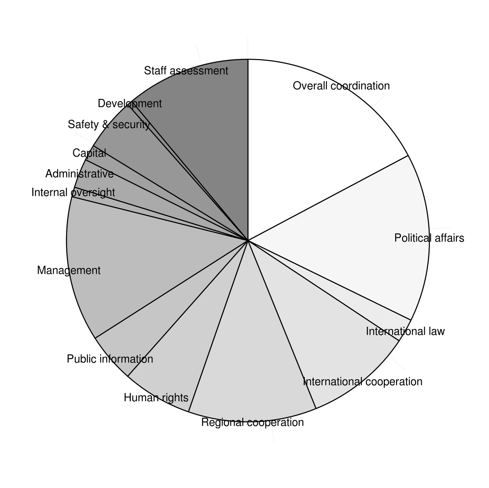
Graphics for Statistics - figures with ggplot - Chapter 2 - Cleveland Dot plot
Chapter 2 - Dot Charts
Graphics out of the book Graphics for Statistics and Data Analysis with R by Kevin Keen (book home page)
Dot charts of the United Nations budget for 2008-2009
- data:
item1<-factor(1:14,
             labels=c("Overall coordination",
               "Political affairs",
               "International law",
               "International cooperation",
               "Regional cooperation",
               "Human rights",
               "Public information",
               "Management",
               "Internal oversight",
               "Administrative",
               "Capital",
               "Safety & security",
               "Development",
               "Staff assessment"))
amount1<-c(718555600,626069600,87269400,398449400,
477145600,259227500,184000500,540204300,35997700,
108470900,58782600,197169300,18651300,461366000)
amount1<-amount1/1000000
df <- data.frame(item1=item1,amount1=amount1)
df
item1  amount1
1       Overall coordination 718.5556
2          Political affairs 626.0696
3          International law  87.2694
4  International cooperation 398.4494
5       Regional cooperation 477.1456
6               Human rights 259.2275
7         Public information 184.0005
8                 Management 540.2043
9         Internal oversight  35.9977
10            Administrative 108.4709
11                   Capital  58.7826
12         Safety & security 197.1693
13               Development  18.6513
14          Staff assessment 461.3660
- now we can build the chart using
geom_point()andgeom_hline()
- first we build a ggplot object and map
xtoamount1andytoitem1
- than we add the point layer (
geom_point()) setting theshapeto 19 (filled circle)
- now we need the horizontal lines, therefore we use
geom_hline()and mapas.numeric(item1)(which gives 1:14) toyintercept
ggplot(df,aes(x=amount1,y=item1)) +
  geom_point(shape=19) +
  geom_hline(aes(yintercept=as.numeric(item1)),linetype=3)
ggsave("fig2_1.png")

- first we reverse the order of the category using
reorder()by the negative of the number of the item
- then we increase the size of the points a little (
sizeargument ingeom_point())
- then we change the title of the x-axis and set the limits to c(0,800) (
scale_x_continuous())
- setting
asis.title.ytotheme_blank()gets us rid of the title of the y-axis
axis.title.xis managed bytheme_text(): we set the textsizeto 12 and adjust the vertical position (vjust) downwards
- last we set the panel background to white using
theme_rect()(and because there are some leftovers of the grid lines visible in the frame we set the major grid lines to blank
ggplot(df,aes(x=amount1,y=reorder(item1,-as.numeric(item1)))) +
  geom_point(shape=19,size=4) +
  geom_hline(aes(yintercept=as.numeric(item1)),linetype=3) +
  scale_x_continuous("Millions of US Dollars",limits=c(0,800)) +
  opts(axis.title.y=theme_blank(),
       axis.text.y=theme_text(size=12),
       axis.title.x=theme_text(size=12,vjust=-0.7),
       axis.text.x=theme_text(size=12),
       panel.background=theme_rect(fill="white"),
       panel.grid.major=theme_blank())
ggsave("fig2_1b.png")

- remains the ticks of the y-axis, again we must use the hack (as in chapter 1 - have a look there for further information)
png("fig2_1c.png",height=500, width=500)
ggplot(df,aes(x=amount1,y=reorder(item1,-as.numeric(item1)))) +
  geom_point(shape=19,size=4) +
  geom_hline(aes(yintercept=as.numeric(item1)),linetype=3) +
  scale_x_continuous("Millions of US Dollars",limits=c(0,800)) +
  opts(axis.title.y=theme_blank(),
       axis.text.y=theme_text(size=12),
       axis.title.x=theme_text(size=12,vjust=-0.7),
       axis.text.x=theme_text(size=12),
       panel.background=theme_rect(fill="white"),
       panel.grid.major=theme_blank())
g <- grid.gget(gPath("axis-l", "", "", "", "axis.ticks.segments"))
grid.remove(g$name)
dev.off()
X11cairo
       2

- to change this figure to figure 2.2 we have just to replace
geom_hline()bygeom_segment()and change therefore some mappings
png("fig2_1d.png",height=500, width=500)
ggplot(df,aes(x=amount1,y=reorder(item1,-as.numeric(item1)))) +
  geom_point(shape=19,size=4) +
  geom_segment(aes(yend=reorder(item1,-as.numeric(item1))),xend=0,linetype=3) +
  scale_x_continuous("Millions of US Dollars",limits=c(0,800)) +
  opts(axis.title.y=theme_blank(),
       axis.text.y=theme_text(size=12),
       axis.title.x=theme_text(size=12,vjust=-0.7),
       axis.text.x=theme_text(size=12),
       panel.background=theme_rect(fill="white"),
       panel.grid.major=theme_blank())
g <- grid.gget(gPath("axis-l", "", "", "", "axis.ticks.segments"))
grid.remove(g$name)
dev.off()
X11cairo
       2

R - Graphics for Statistics - figures with ggplot 2
chapter1
Graphics out of the book Graphics for Statistics and Data Analysis with R by Kevin Keen (book home page)
dot chart of prevalence of allergy in endoscopic sinus surgery (figure 1.1)
- first create the data frame (which is mandatory)
names<-factor(1:6,labels=c("Epidermals","Dust Mites","Weeds","Grasses","Molds","Trees"))
prevs<-c(38.2,37.8,31.1,31.1,29.3,26.7)
df <- data.frame(names=names,prevs=prevs)
df
names prevs
1 Epidermals  38.2
2 Dust Mites  37.8
3      Weeds  31.1
4    Grasses  31.1
5      Molds  29.3
6      Trees  26.7
- now we can create the dot chart using geomsegment() (lines) and geompoint()
- we map
xtoprevsandytonamesfor all layers
- in
geom_segment()we map additionallyyendto names and setxendto zero andlinetypeto 3 (dotted)
- in
geom_point()we setshapeto 19 (small filled circle)
- than we set the limits of the x axis to c(0,50) accordingly to the book chart, set the title to Percent and get rid of the title of the y axis
ggplot(df,aes(x=prevs,y=names)) +
   geom_segment(aes(yend=names),xend=0,linetype=3) +
   geom_point(shape=19) +
   scale_x_continuous("Percent",limits=c(0,50)) +
   opts(axis.title.y=theme_blank())
ggsave("fig1_1.png")

Saving 7 x 6.99 in image
bar chart of prevalence of allergy in endoscopic sinus surgery (figure 1.1)
- now we map
xtonamesandytoprevs
- we use geombar(); we have to change the stat to "identity" because we use presummarised data (the default stat of the geom is "bin")
- then we change the appearance of the axes as above
ggplot(df,aes(x=names,y=prevs)) +
   geom_bar(stat="identity") +
   scale_y_continuous("Percent",limits=c(0,50)) +
   opts(axis.title.x=theme_blank())
ggsave("fig1_2.png")
Saving 7 x 6.99 in image

- this looks fine for now; but in the book graph the labels are rotated and the bins are looking a bit narrower
- the width of the bins is changed through the
widthargument ingeom_bar(); in this case it is a bit tricky, because using the identity stat resetswidthso we have to putwidthin to theaes()argument (further information)
- rotating the labels is done via
opts()andtext_theme()(angle)
- I also resize the labels (
size)
- and get rid of the axis ticks (
axis.ticks=theme_blank())
ggplot(df,aes(x=names,y=prevs)) +
       geom_bar(aes(width=0.7),stat="identity") +
       scale_y_continuous("Percent",limits=c(0,50)) +
       opts(axis.title.x=theme_blank(),
            axis.text.x=theme_text(angle=90,size=12),
            axis.ticks=theme_blank())
ggsave("fig1_2b.png")
Saving 7 x 6.99 in image

- unfortunately there are no ticks on the y axis as well, further more: in the current version of ggplot there is no equivalent to axis.ticks.x, so if you want to get rid of the ticks of just one axis you must use this hack (link)
- another consequence is that ggsave does not work on the grid.remove edit - so we have to save the chart in the old fashioned way
png("fig1_2c.png",height=500, width=500)
ggplot(df,aes(x=names,y=prevs)) +
       geom_bar(aes(width=0.5),stat="identity") +
       scale_y_continuous("Percent",limits=c(0,50)) +
       opts(axis.title.x=theme_blank(),
       axis.text.x=theme_text(angle=90,size=12))
g <- grid.gget(gPath("axis-b", "", "", "", "axis.ticks.segments"))
grid.remove(g$name)
dev.off()
X11cairo
       2

ggplot9.2 is out - and everything much easier:
- you do not need to manipulate the grid elements directly,
axis.ticks.xandaxis.ticks.yare now available
axis.linedoes a good job to customize the axes
- there are also some functions renamed: use
themeinstead ofoptsandelementinstead oftheme
ggplot(df,aes(x=names,y=prevs)) +
  geom_bar(aes(width=0.5),stat="identity") +
  scale_y_continuous("Percent",limits=c(0,50),expand=c(0,0)) +
  theme(axis.title.x=element_blank(),
        axis.text.x=element_text(angle=90,size=12,colour="black",hjust=1),
        axis.text.y=element_text(size=12,colour="black"),
        axis.line=element_line(colour="black"),
        axis.ticks.x=element_blank(),
        panel.background=element_rect(fill="white")
        )

Thursday, September 6, 2012
Obesity maps 2011 - BRFSS - the data 2011 are online
Data are available here- I added the maps for overweight and obesity, download
- script available here
 |
| rebuild cdc obesity maps with ggplot |
Sunday, August 12, 2012
ruby rails - examples for date time helpers
with the time helpers it is amazingly easy to deal with dates and times (add, diff...)
$ rails console
  >> 1.year.from_now
  => Sun, 13 Mar 2011 03:38:55 UTC +00:00
  >> 10.weeks.ago
  => Sat, 02 Jan 2010 03:39:14 UTC +00:00
  >> 1.hour.from_now
  => Sun, 12 Aug 2012 09:52:39 UTC +00:00
  >> 30.seconds.from_now
  => Sun, 12 Aug 2012 08:54:00 UTC +00:00
Thursday, August 9, 2012
rails haml - translations
<%= yield %> --> .content#content= yield
<%= csrf_meta_tag %> --> = csrf_meta_tag
<%= csrf_meta_tag %> --> = csrf_meta_tag
use stylesheets
<%= stylesheet_link_tag 'blueprint/screen', :media => 'screen' %> --> = stylesheet_link_tag 'main'
ruby rails - set up autotest
http://www.andrewsturges.com/2011/06/installing-autotest-with-rails-31-and.html
+ run: rails g rspec:install (rspec-rails have to be installed)
+ run: rails g rspec:install (rspec-rails have to be installed)
Wednesday, August 8, 2012
ruby - problems with rvm
if rvm does not set the right ruby version:
http://stackoverflow.com/questions/9056008/installed-ruby-1-9-3-with-rvm-but-command-line-doesnt-show-ruby-v/9056395#9056395
http://stackoverflow.com/questions/9056008/installed-ruby-1-9-3-with-rvm-but-command-line-doesnt-show-ruby-v/9056395#9056395
Saturday, August 4, 2012
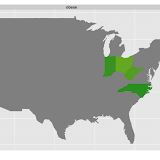
R ggplot - rebuild cdc obesity maps - 1984-2011
redoing the cdc obesity maps with ggplot2

|
| rebuild cdc obesity maps with ggplot |
Slideshow
- first obese rates
- second overweight rates
- and if the slide show does not work - here is the link to the
pictures
Table of Contents
1 get the data
- I downloaded the data from http://www.cdc.gov/brfss/technical_infodata/surveydata.htm
- for the years 1984 - 1997 I use read.xport() (foreign package) on the sas xpt files
- then the data sets became to large, so I used the ascii files read.fortran() and choose just a few columns
- here is a resulting example data set (2006 - I computed the bmi2 column for checking)
- 2012-09: I added the maps for 2011 since the new data were out
head(x2006)
State month day year age weight height sex htm   wkg  bmi bmigr bmirisk
1     1     5   2 2006  66    263    503   2 160 11955 4669     3       2
2     1     9  19 2006  56    290    603   1 191 13182 3632     3       2
3     1    12  12 2006  40    230    511   1 180 10455 3215     3       2
4     1     4  29 2006  38    320    603   1 191 14545 4008     3       2
5     1     4  29 2006  52    120    504   2 163  5455 2064     1       1
6     1     8   2 2006  32    165    510   2 178  7500 2372     1       1
  heightcm  weightkg     bmi2
1   160.02 119.29417 46.58764
2   190.50 131.54110 36.24695
3   180.34 104.32570 32.07799
4   190.50 145.14880 39.99664
5   162.56  54.43080 20.59763
6   177.80  74.84235 23.67467
2 compute rates and plot the graphs
library(ggplot2)
library(scales)
library(plyr)
library(maps)

## map of the states (part of the map package)
states_map <- map_data("state")
states_map$region <- factor(states_map$region)

## got fips form here and saved it as txt; http://www.epa.gov/enviro/html/codes/state.html
fips <- read.table("states.txt",sep="\t",header=T)
fips$State.Name <- tolower(as.character(fips$State.Name))

## build the graphs

filenames <- paste("bmi",1984:2010,".rdata",sep="")
for(file in filenames){
  load(file)
  year <- substr(file,4,7)
  x <- get(paste("x",year,sep=""))

  ## for adding the year to the plot
  testdf <- data.frame(x2=-70,y2=49,year=year)
  ## for the first 4 years was no bmi in the data set
  ## I named my computed one "bmi" so I need another "bmi2" for the loop, not very sophisticated,
  ## but it works

  if(!("bmi2" %in% names(x))){
    print(file)
    x$bmi2 <- x$bmi
  }

## bmi groups
  x$bmi2gr <- cut(x$bmi2,breaks=c(0,25,30,300),include.lowest=T,labels=c("1","2","3"))

## count
  x <- ddply(x,.(State),transform,perstate=sum(!is.na(bmi2)))
  x <- ddply(x,.(State,bmi2gr),transform,perstate.gr=sum(!is.na(bmi2)))

  dats <- unique(x[,c("State","bmi2gr","perstate","perstate.gr")])
  dats <- dats[!is.na(dats$bmi2gr),]

## percents
  dats$perc <- dats$perstate.gr/dats$perstate
  dats$ow <- as.numeric(dats$bmi2gr) > 1

## I just want the obese and overweight
## >= 25
  dats2 <- dats[dats$ow==T,]
  dats2 <- ddply(dats2,.(State),summarize,perc=sum(perc))
  dats2$gr <- "ow"

## >= 30
  dats3 <- dats[dats$bmi2gr=="3",c("State","perc")]
  dats3$gr <- "obese"

  dats <- rbind(dats2,dats3)

## identify the states in the data set using the region names in the map (fips coded)
  dats <- merge(dats,fips[,2:3],by.x="State",by.y="FIPS.Code",all=T)
  dats$gr[is.na(dats$gr)] <- "obese"
  dats$State.Name <- factor(dats$State.Name)

## graph
  ggplot(dats[dats$gr=="obese",],aes(map_id = State.Name)) +
  geom_map(aes(fill=perc),colour="black",map = states_map) +
  expand_limits(x = states_map$long, y = states_map$lat) +
  scale_fill_gradientn(limits=c(0.1,0.7),colours=cols,guide = guide_colorbar(),na.value="grey50")  +
  geom_text(data=testdf,aes(x=x2,y=y2,label=year),inherit.aes=F)

## save image
  ggsave(file=paste("obese",substr(file,4,7),".png",sep=""))
}
output
[1] "bmi1984.rdata"
Saving 12.7 x 7.01 in image
[1] "bmi1985.rdata"
Saving 12.7 x 7.01 in image
[1] "bmi1986.rdata"
Saving 12.7 x 7.01 in image
[1] "bmi1987.rdata"
Saving 12.7 x 7.01 in image
Saving 12.7 x 7.01 in image
Saving 12.7 x 7.01 in image
Saving 12.7 x 7.01 in image
Saving 12.7 x 7.01 in image
Saving 12.7 x 7.01 in image
Saving 12.7 x 7.01 in image
Saving 12.7 x 7.01 in image
Saving 12.7 x 7.01 in image
Saving 12.7 x 7.01 in image
Saving 12.7 x 7.01 in image
Saving 12.7 x 7.01 in image
Saving 12.7 x 7.01 in image
Saving 12.7 x 7.01 in image
Saving 12.7 x 7.01 in image
Saving 12.7 x 7.01 in image
Saving 12.7 x 7.01 in image
Saving 12.7 x 7.01 in image
Saving 12.7 x 7.01 in image
Saving 12.7 x 7.01 in image
Saving 12.7 x 7.01 in image
Saving 12.7 x 7.01 in image
Saving 12.7 x 7.01 in image
Saving 12.7 x 7.01 in image
Monday, June 25, 2012
Saturday, April 28, 2012
Monday, April 16, 2012
Convert ERb into HAML (via rake)
install these gems:
haml-rails
ruby_parser
hpricot
now run rake
and don't forget that its not rake erb2html, its rake erb2haml!
From:
here
PS:
gem 'ruby_parser'
gem 'hpricot'
haml-rails
ruby_parser
hpricot
#./lib/tasks/erb2haml.rake
desc "Creates haml files for each of the erb files found under views (skips existing)"
task :erb2haml do
  from_path = File.join(File.dirname(__FILE__), '..', '..', 'app', 'views')
  Dir["#{from_path}/**/*.erb"].each do |file|
    puts file
  # for each .erb file in the path, convert it & output to a .haml file
  output_file = file.gsub(/\.erb$/, '.haml')
  `bundle exec html2haml -ex #{file} #{output_file}` unless File.exist?(output_file)
 end
end
now run rake
and don't forget that its not rake erb2html, its rake erb2haml!
From:
here
PS:
gem 'ruby_parser'
gem 'hpricot'
Sunday, April 15, 2012
set up git for the first use (with rails)
After installing the packages git-core and gitosis:
configure
run
customize the
examples here
add your project to git
to see which files are in the staging area:
to tell Git you want to keep the changes
list of commit messages:
undo changes
configure
git config --global user.name "username"
git config --global user.email "user@mail.com"
git config --global core.editor "emacs -w"
run
git init
customize the
.gitignore fileexamples here
add your project to git
git add . ## from your project folder
to see which files are in the staging area:
git status
to tell Git you want to keep the changes
git commit -m "initial commit"
list of commit messages:
git log
undo changes
git checkout -f ## -f flag to force overwriting the current changes
Saturday, April 14, 2012
Wednesday, March 21, 2012
Saturday, March 17, 2012
R - dates with lubridate
datetime
Table of Contents
1 package lubridate
1.1 reading dates with lubridate
- lubridate is a relatively new package which allows to handle date and date time formats in a more convenient way than it was possible with
format()
- first load the package
library(lubridate)
- if you want to read date or convert some data into date/date time format you can use
ymd()
- the first argument to
ymd()have to be numeric oder string vector of suspected dates
- it should be used if there is a year, month and time component in a arbitry order, seperated by one of the following seperators: "-", "/", ".", and ""
- analogous
ymdshould appear in one of the following order:ymd,ydm,mdy,myd,dmy,dym
- there is a optional argument
tzto specify which time zone to parse the date with (string, known by the OS)
ydm(12051103) # ->  "1205-03-11 UTC"
ymd(12051103) # ->  "1205-11-03 UTC"
dym(12051103) # ->  "511-03-12 UTC"
dmy(12051103) # ->  "1103-05-12 UTC"
mdy(12051103) # ->  "1103-12-05 UTC"
myd(12051103) # ->  "511-12-03 UTC"
[1] "1205-03-11 UTC"
[1] "1205-11-03 UTC"
[1] "511-03-12 UTC"
[1] "1103-05-12 UTC"
[1] "1103-12-05 UTC"
[1] "511-12-03 UTC"
- it can also deal with the year consisting of two digits
dym(120503) # -> "2005-03-12 UTC"
dym(127503) # -> "1975-03-12 UTC"
[1] "2005-03-12 UTC"
[1] "1975-03-12 UTC"
- extract information:
- day
- day
my.date <- dym(120503)
day(my.date)
[1] 12
- week day (number)
wday(my.date)
[1] 7
- week day (string)
wday(my.date,label=T)
[1] Sat
Levels: Sun < Mon < Tues < Wed < Thurs < Fri < Sat
- year
year(my.date)
[1] 2005
- month (number)
month(my.date)
[1] 3
- month (name of month)
month(my.date,label=T)
[1] Mar
12 Levels: Jan < Feb < Mar < Apr < May < Jun < Jul < Aug < Sep < ... < Dec
- week
week(my.date)
[1] 11
- day of year
yday(my.date)
[1] 71
1.2 working with dates
- get the origin of the current time scale
origin
[1] "1970-01-01 GMT"
- get the current date
x <- today()
x
[1] "2012-03-17"
- week of current day
week(x)
- two weeks later
week(x) <- week(x) + 2
x
- is also a Saturday
wday(x,label=T)
 [1] Sat
Levels: Sun < Mon < Tues < Wed < Thurs < Fri < Sat
- rounding:
floor_date(),ceiling_date()
- rounding down and up to the nearest integer day value
- rounding down and up to the nearest integer day value
floor_date(my.date,"day")     # -> "2005-03-12 UTC"
ceiling_date(my.date,"day")   # -> "2005-03-13 UTC"
[1] "2005-03-12 UTC"
[1] "2005-03-13 UTC"
- rounding down and up to the nearest integer month value
floor_date(my.date,"month")     # ->  "2005-03-01 UTC"
ceiling_date(my.date,"month")   # ->  "2005-04-01 UTC"
[1] "2005-03-01 UTC"
[1] "2005-04-01 UTC"
- rounding down and up to the nearest integer year value
floor_date(my.date,"year")     # ->  "2005-01-01 UTC"
ceiling_date(my.date,"year")   # ->  "2006-01-01 UTC"
[1] "2005-01-01 UTC"
[1] "2006-01-01 UTC"
- is a year a leap-year (argument has to be a date)
leap_year(ymd("20000101"))- create a time interval given start and end point
date1 <- ymd("2000-01-01")
date2 <- ymd("2000-10-01")
my.int <- new_interval(date1,date2)
my.int
[1] 2000-01-01 UTC--2000-10-01 UTC
- check whether or not a date falls within an interval
date3 <- ymd("2001-01-02")
date3 %within% my.int
[1] FALSE
or
date4 <- ymd("2000-06-02")
date4 %within% my.int
[1] TRUE
- check whether or not an interval falls within an interval
my.int2 <- new_interval(date1,date4)
my.int2 %within% my.int
[1] TRUE
Subscribe to:
Posts
(
Atom
)