Saturday, September 8, 2012

Graphics for Statistics - figures with ggplot - Chapter 2 - Cleveland Dot plot

Chapter 2 - Dot Charts


Graphics out of the book Graphics for Statistics and Data Analysis with R by Kevin Keen (book home page)


Dot charts of the United Nations budget for 2008-2009


  • data:

item1<-factor(1:14,
             labels=c("Overall coordination",
               "Political affairs",
               "International law",
               "International cooperation",
               "Regional cooperation",
               "Human rights",
               "Public information",
               "Management",
               "Internal oversight",
               "Administrative",
               "Capital",
               "Safety & security",
               "Development",
               "Staff assessment"))
amount1<-c(718555600,626069600,87269400,398449400,
477145600,259227500,184000500,540204300,35997700,
108470900,58782600,197169300,18651300,461366000)
amount1<-amount1/1000000
df <- data.frame(item1=item1,amount1=amount1)
df

item1  amount1
1       Overall coordination 718.5556
2          Political affairs 626.0696
3          International law  87.2694
4  International cooperation 398.4494
5       Regional cooperation 477.1456
6               Human rights 259.2275
7         Public information 184.0005
8                 Management 540.2043
9         Internal oversight  35.9977
10            Administrative 108.4709
11                   Capital  58.7826
12         Safety & security 197.1693
13               Development  18.6513
14          Staff assessment 461.3660

  • now we can build the chart using geom_point() and geom_hline()
  • first we build a ggplot object and map x to amount1 and y to item1
  • than we add the point layer (geom_point()) setting the shape to 19 (filled circle)
  • now we need the horizontal lines, therefore we use geom_hline() and map as.numeric(item1) (which gives 1:14) to yintercept

ggplot(df,aes(x=amount1,y=item1)) +
  geom_point(shape=19) +
  geom_hline(aes(yintercept=as.numeric(item1)),linetype=3)
ggsave("fig2_1.png")


  • first we reverse the order of the category using reorder() by the negative of the number of the item
  • then we increase the size of the points a little (size argument in geom_point())
  • then we change the title of the x-axis and set the limits to c(0,800) (scale_x_continuous())
  • setting asis.title.y to theme_blank() gets us rid of the title of the y-axis
  • axis.title.x is managed by theme_text(): we set the text size to 12 and adjust the vertical position (vjust) downwards
  • last we set the panel background to white using theme_rect() (and because there are some leftovers of the grid lines visible in the frame we set the major grid lines to blank

ggplot(df,aes(x=amount1,y=reorder(item1,-as.numeric(item1)))) +
  geom_point(shape=19,size=4) +
  geom_hline(aes(yintercept=as.numeric(item1)),linetype=3) +
  scale_x_continuous("Millions of US Dollars",limits=c(0,800)) +
  opts(axis.title.y=theme_blank(),
       axis.text.y=theme_text(size=12),
       axis.title.x=theme_text(size=12,vjust=-0.7),
       axis.text.x=theme_text(size=12),
       panel.background=theme_rect(fill="white"),
       panel.grid.major=theme_blank())
ggsave("fig2_1b.png")


  • remains the ticks of the y-axis, again we must use the hack (as in chapter 1 - have a look there for further information)

png("fig2_1c.png",height=500, width=500)
ggplot(df,aes(x=amount1,y=reorder(item1,-as.numeric(item1)))) +
  geom_point(shape=19,size=4) +
  geom_hline(aes(yintercept=as.numeric(item1)),linetype=3) +
  scale_x_continuous("Millions of US Dollars",limits=c(0,800)) +
  opts(axis.title.y=theme_blank(),
       axis.text.y=theme_text(size=12),
       axis.title.x=theme_text(size=12,vjust=-0.7),
       axis.text.x=theme_text(size=12),
       panel.background=theme_rect(fill="white"),
       panel.grid.major=theme_blank())
g <- grid.gget(gPath("axis-l", "", "", "", "axis.ticks.segments"))
grid.remove(g$name)
dev.off()

X11cairo 
       2


  • to change this figure to figure 2.2 we have just to replace geom_hline() by geom_segment() and change therefore some mappings

png("fig2_1d.png",height=500, width=500)
ggplot(df,aes(x=amount1,y=reorder(item1,-as.numeric(item1)))) +
  geom_point(shape=19,size=4) +
  geom_segment(aes(yend=reorder(item1,-as.numeric(item1))),xend=0,linetype=3) +
  scale_x_continuous("Millions of US Dollars",limits=c(0,800)) +
  opts(axis.title.y=theme_blank(),
       axis.text.y=theme_text(size=12),
       axis.title.x=theme_text(size=12,vjust=-0.7),
       axis.text.x=theme_text(size=12),
       panel.background=theme_rect(fill="white"),
       panel.grid.major=theme_blank())
g <- grid.gget(gPath("axis-l", "", "", "", "axis.ticks.segments"))
grid.remove(g$name)
dev.off()

X11cairo 
       2


R - Graphics for Statistics - figures with ggplot 2

chapter1


Graphics out of the book Graphics for Statistics and Data Analysis with R by Kevin Keen (book home page)


dot chart of prevalence of allergy in endoscopic sinus surgery (figure 1.1)


  • first create the data frame (which is mandatory)

names<-factor(1:6,labels=c("Epidermals","Dust Mites","Weeds","Grasses","Molds","Trees"))
prevs<-c(38.2,37.8,31.1,31.1,29.3,26.7)
df <- data.frame(names=names,prevs=prevs)
df

names prevs
1 Epidermals  38.2
2 Dust Mites  37.8
3      Weeds  31.1
4    Grasses  31.1
5      Molds  29.3
6      Trees  26.7

  • now we can create the dot chart using geomsegment() (lines) and geompoint()
  • we map x to prevs and y to names for all layers
  • in geom_segment() we map additionally yend to names and set xend to zero and linetype to 3 (dotted)
  • in geom_point() we set shape to 19 (small filled circle)
  • than we set the limits of the x axis to c(0,50) accordingly to the book chart, set the title to Percent and get rid of the title of the y axis

ggplot(df,aes(x=prevs,y=names)) + 
   geom_segment(aes(yend=names),xend=0,linetype=3) + 
   geom_point(shape=19) +
   scale_x_continuous("Percent",limits=c(0,50)) +
   opts(axis.title.y=theme_blank())
ggsave("fig1_1.png")


Saving 7 x 6.99 in image

bar chart of prevalence of allergy in endoscopic sinus surgery (figure 1.1)


  • now we map x to names and y to prevs
  • we use geombar(); we have to change the stat to "identity" because we use presummarised data (the default stat of the geom is "bin")
  • then we change the appearance of the axes as above

ggplot(df,aes(x=names,y=prevs)) + 
   geom_bar(stat="identity") +
   scale_y_continuous("Percent",limits=c(0,50)) +
   opts(axis.title.x=theme_blank())
ggsave("fig1_2.png")

Saving 7 x 6.99 in image


  • this looks fine for now; but in the book graph the labels are rotated and the bins are looking a bit narrower
  • the width of the bins is changed through the width argument in geom_bar(); in this case it is a bit tricky, because using the identity stat resets width so we have to put width in to the aes() argument (further information)
  • rotating the labels is done via opts() and text_theme() (angle)
  • I also resize the labels (size)
  • and get rid of the axis ticks (axis.ticks=theme_blank())

ggplot(df,aes(x=names,y=prevs)) + 
       geom_bar(aes(width=0.7),stat="identity") +
       scale_y_continuous("Percent",limits=c(0,50)) +
       opts(axis.title.x=theme_blank(),
            axis.text.x=theme_text(angle=90,size=12),
            axis.ticks=theme_blank())
ggsave("fig1_2b.png")

Saving 7 x 6.99 in image


  • unfortunately there are no ticks on the y axis as well, further more: in the current version of ggplot there is no equivalent to axis.ticks.x, so if you want to get rid of the ticks of just one axis you must use this hack (link)
  • another consequence is that ggsave does not work on the grid.remove edit - so we have to save the chart in the old fashioned way

png("fig1_2c.png",height=500, width=500)
ggplot(df,aes(x=names,y=prevs)) + 
       geom_bar(aes(width=0.5),stat="identity") +
       scale_y_continuous("Percent",limits=c(0,50)) +
       opts(axis.title.x=theme_blank(),
       axis.text.x=theme_text(angle=90,size=12))
g <- grid.gget(gPath("axis-b", "", "", "", "axis.ticks.segments"))
grid.remove(g$name)
dev.off()

X11cairo 
       2


ggplot9.2 is out - and everything much easier:

  • you do not need to manipulate the grid elements directly, axis.ticks.x and axis.ticks.y are now available
  • axis.line does a good job to customize the axes
  • there are also some functions renamed: use theme instead of opts and element instead of theme


ggplot(df,aes(x=names,y=prevs)) + 
  geom_bar(aes(width=0.5),stat="identity") +
  scale_y_continuous("Percent",limits=c(0,50),expand=c(0,0)) +
  theme(axis.title.x=element_blank(),
        axis.text.x=element_text(angle=90,size=12,colour="black",hjust=1),
        axis.text.y=element_text(size=12,colour="black"),
        axis.line=element_line(colour="black"),
        axis.ticks.x=element_blank(),
        panel.background=element_rect(fill="white")
        )


Sunday, August 12, 2012

ruby rails - examples for date time helpers

with the time helpers it is amazingly easy to deal with dates and times (add, diff...)

$ rails console
  >> 1.year.from_now
  => Sun, 13 Mar 2011 03:38:55 UTC +00:00
  >> 10.weeks.ago
  => Sat, 02 Jan 2010 03:39:14 UTC +00:00
  >> 1.hour.from_now
  => Sun, 12 Aug 2012 09:52:39 UTC +00:00 
  >> 30.seconds.from_now
  => Sun, 12 Aug 2012 08:54:00 UTC +00:00 
 

Thursday, August 9, 2012

rails haml - translations

<%= yield %>                 -->       .content#content= yield
<%= csrf_meta_tag %>  -->       = csrf_meta_tag
use stylesheets
<%= stylesheet_link_tag 'blueprint/screen', :media => 'screen' %> -->   = stylesheet_link_tag 'main'

ruby rails - set up autotest

http://www.andrewsturges.com/2011/06/installing-autotest-with-rails-31-and.html

+ run: rails g rspec:install (rspec-rails have to be installed)

Saturday, August 4, 2012

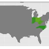
R ggplot - rebuild cdc obesity maps - 1984-2011


redoing the cdc obesity maps with ggplot2


rebuild cdc obesity maps with ggplot

Slideshow


  • first obese rates
  • second overweight rates
  • and if the slide show does not work - here is the link to the
    pictures


1 get the data


  • I downloaded the data from http://www.cdc.gov/brfss/technical_infodata/surveydata.htm
  • for the years 1984 - 1997 I use read.xport() (foreign package) on the sas xpt files
  • then the data sets became to large, so I used the ascii files read.fortran() and choose just a few columns
  • here is a resulting example data set (2006 - I computed the bmi2 column for checking)
  • 2012-09: I added the maps for 2011 since the new data were out

head(x2006)

State month day year age weight height sex htm   wkg  bmi bmigr bmirisk
1     1     5   2 2006  66    263    503   2 160 11955 4669     3       2
2     1     9  19 2006  56    290    603   1 191 13182 3632     3       2
3     1    12  12 2006  40    230    511   1 180 10455 3215     3       2
4     1     4  29 2006  38    320    603   1 191 14545 4008     3       2
5     1     4  29 2006  52    120    504   2 163  5455 2064     1       1
6     1     8   2 2006  32    165    510   2 178  7500 2372     1       1
  heightcm  weightkg     bmi2
1   160.02 119.29417 46.58764
2   190.50 131.54110 36.24695
3   180.34 104.32570 32.07799
4   190.50 145.14880 39.99664
5   162.56  54.43080 20.59763
6   177.80  74.84235 23.67467

2 compute rates and plot the graphs


library(ggplot2)
library(scales)
library(plyr)
library(maps)

## map of the states (part of the map package)
states_map <- map_data("state")
states_map$region <- factor(states_map$region)

## got fips form here and saved it as txt; http://www.epa.gov/enviro/html/codes/state.html
fips <- read.table("states.txt",sep="\t",header=T)
fips$State.Name <- tolower(as.character(fips$State.Name))

## build the graphs 

filenames <- paste("bmi",1984:2010,".rdata",sep="")
for(file in filenames){
  load(file)
  year <- substr(file,4,7)
  x <- get(paste("x",year,sep=""))

  ## for adding the year to the plot
  testdf <- data.frame(x2=-70,y2=49,year=year)
  ## for the first 4 years was no bmi in the data set 
  ## I named my computed one "bmi" so I need another "bmi2" for the loop, not very sophisticated, 
  ## but it works 

  if(!("bmi2" %in% names(x))){
    print(file)
    x$bmi2 <- x$bmi
  }

## bmi groups
  x$bmi2gr <- cut(x$bmi2,breaks=c(0,25,30,300),include.lowest=T,labels=c("1","2","3"))

## count
  x <- ddply(x,.(State),transform,perstate=sum(!is.na(bmi2)))
  x <- ddply(x,.(State,bmi2gr),transform,perstate.gr=sum(!is.na(bmi2)))

  dats <- unique(x[,c("State","bmi2gr","perstate","perstate.gr")])
  dats <- dats[!is.na(dats$bmi2gr),]

## percents
  dats$perc <- dats$perstate.gr/dats$perstate
  dats$ow <- as.numeric(dats$bmi2gr) > 1

## I just want the obese and overweight
## >= 25
  dats2 <- dats[dats$ow==T,]
  dats2 <- ddply(dats2,.(State),summarize,perc=sum(perc))
  dats2$gr <- "ow"

## >= 30
  dats3 <- dats[dats$bmi2gr=="3",c("State","perc")]
  dats3$gr <- "obese"

  dats <- rbind(dats2,dats3)

## identify the states in the data set using the region names in the map (fips coded)
  dats <- merge(dats,fips[,2:3],by.x="State",by.y="FIPS.Code",all=T)
  dats$gr[is.na(dats$gr)] <- "obese"
  dats$State.Name <- factor(dats$State.Name)

## graph
  ggplot(dats[dats$gr=="obese",],aes(map_id = State.Name)) +
  geom_map(aes(fill=perc),colour="black",map = states_map) +
  expand_limits(x = states_map$long, y = states_map$lat) +
  scale_fill_gradientn(limits=c(0.1,0.7),colours=cols,guide = guide_colorbar(),na.value="grey50")  +
  geom_text(data=testdf,aes(x=x2,y=y2,label=year),inherit.aes=F)

## save image
  ggsave(file=paste("obese",substr(file,4,7),".png",sep=""))
}

output
[1] "bmi1984.rdata"
Saving 12.7 x 7.01 in image
[1] "bmi1985.rdata"
Saving 12.7 x 7.01 in image
[1] "bmi1986.rdata"
Saving 12.7 x 7.01 in image
[1] "bmi1987.rdata"
Saving 12.7 x 7.01 in image

Date: 2012-08-04 21:24:07 CEST

Author: mandy

Org version 7.8.02 with Emacs version 23

Validate XHTML 1.0